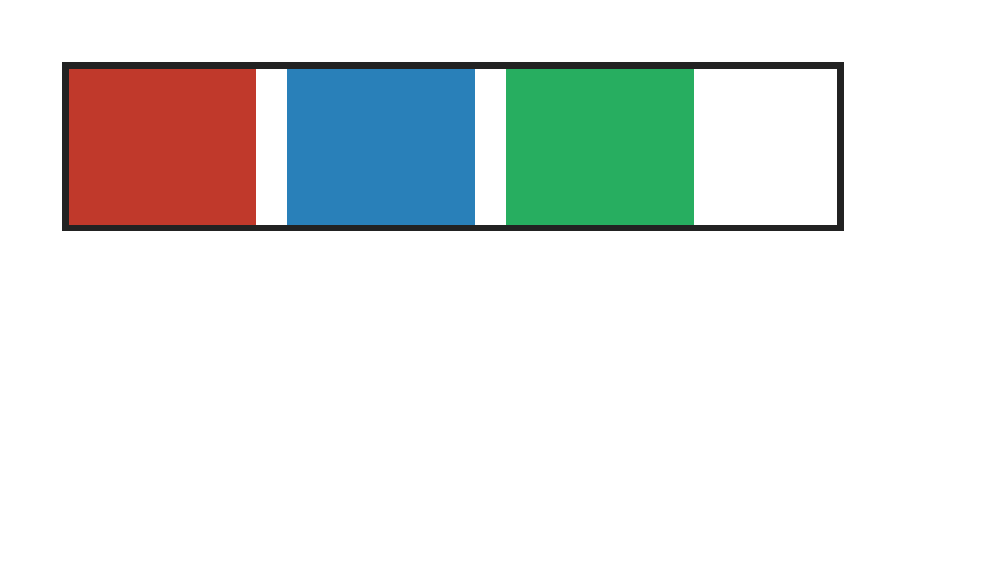
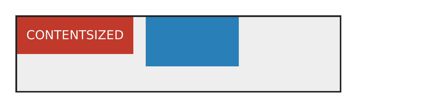
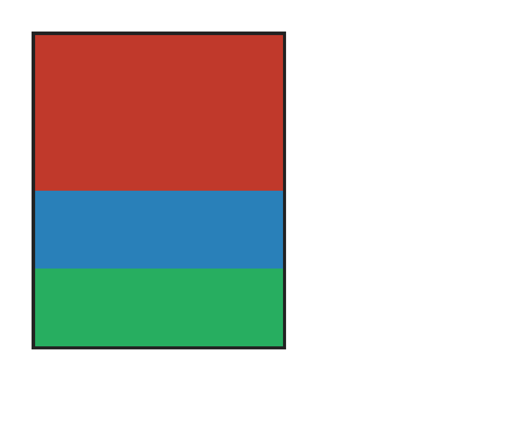
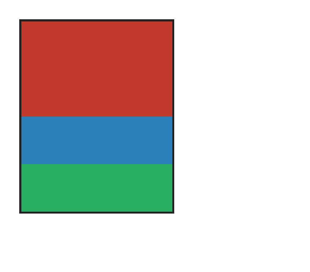
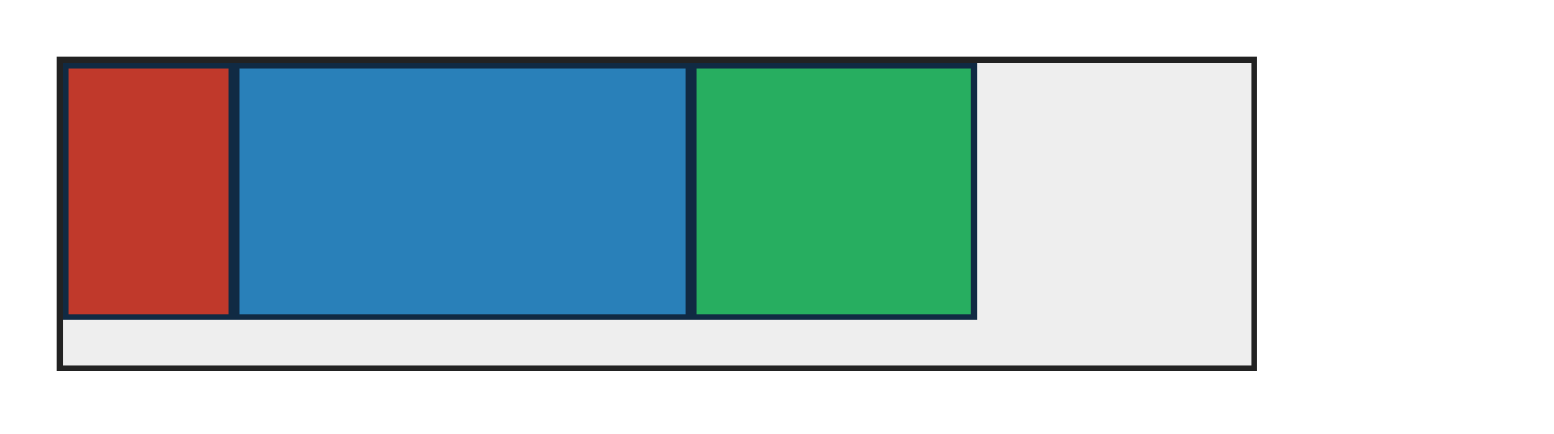
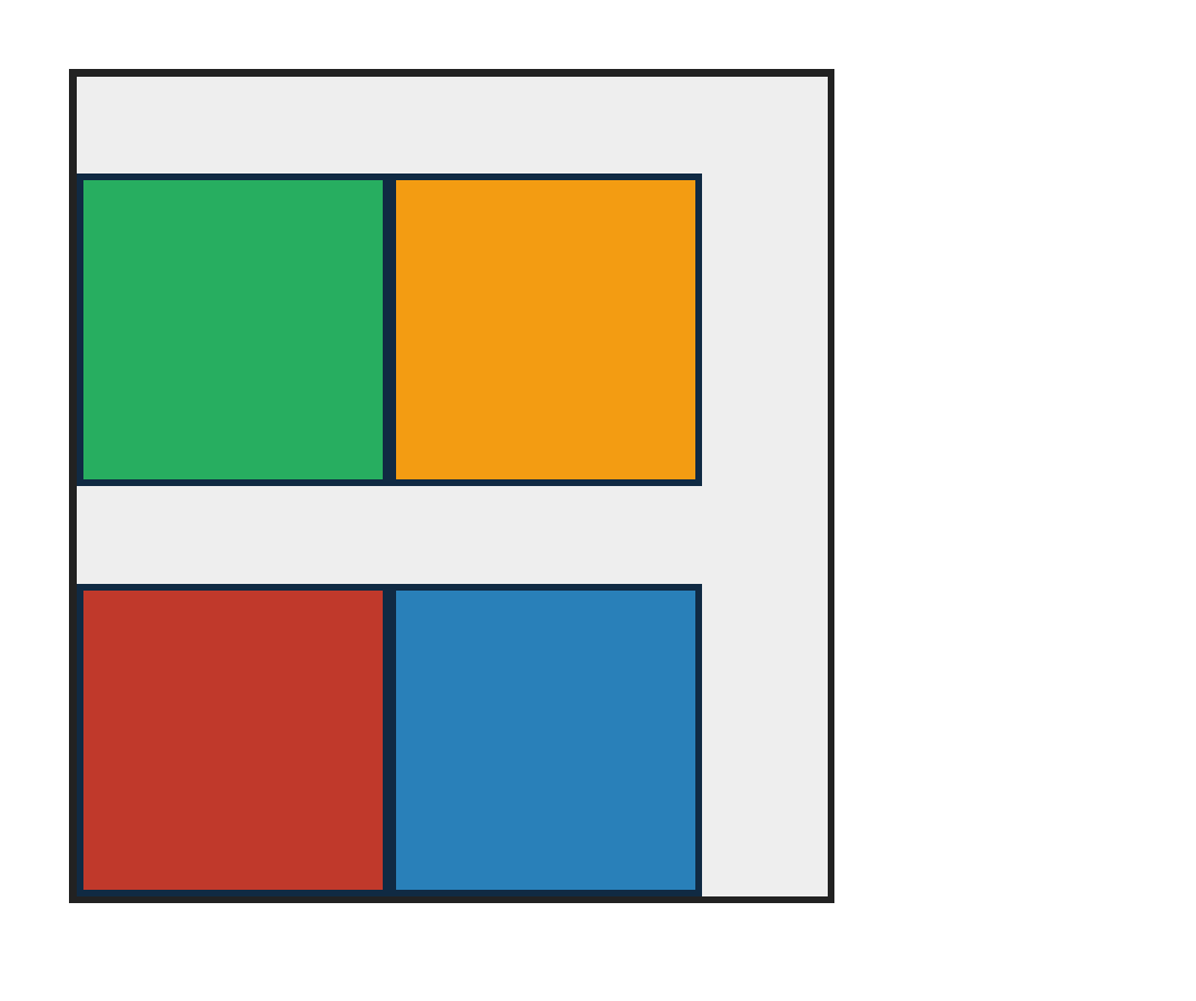
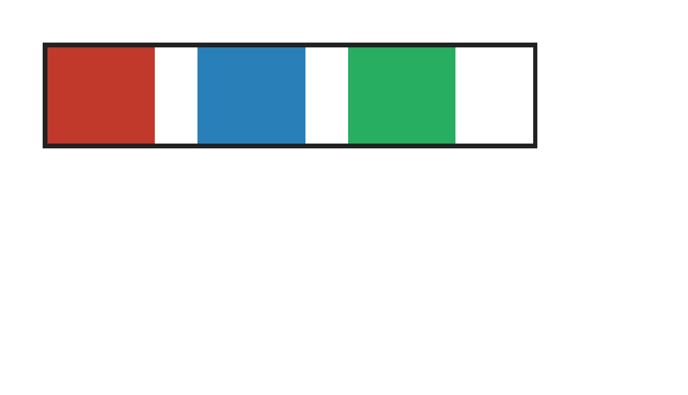
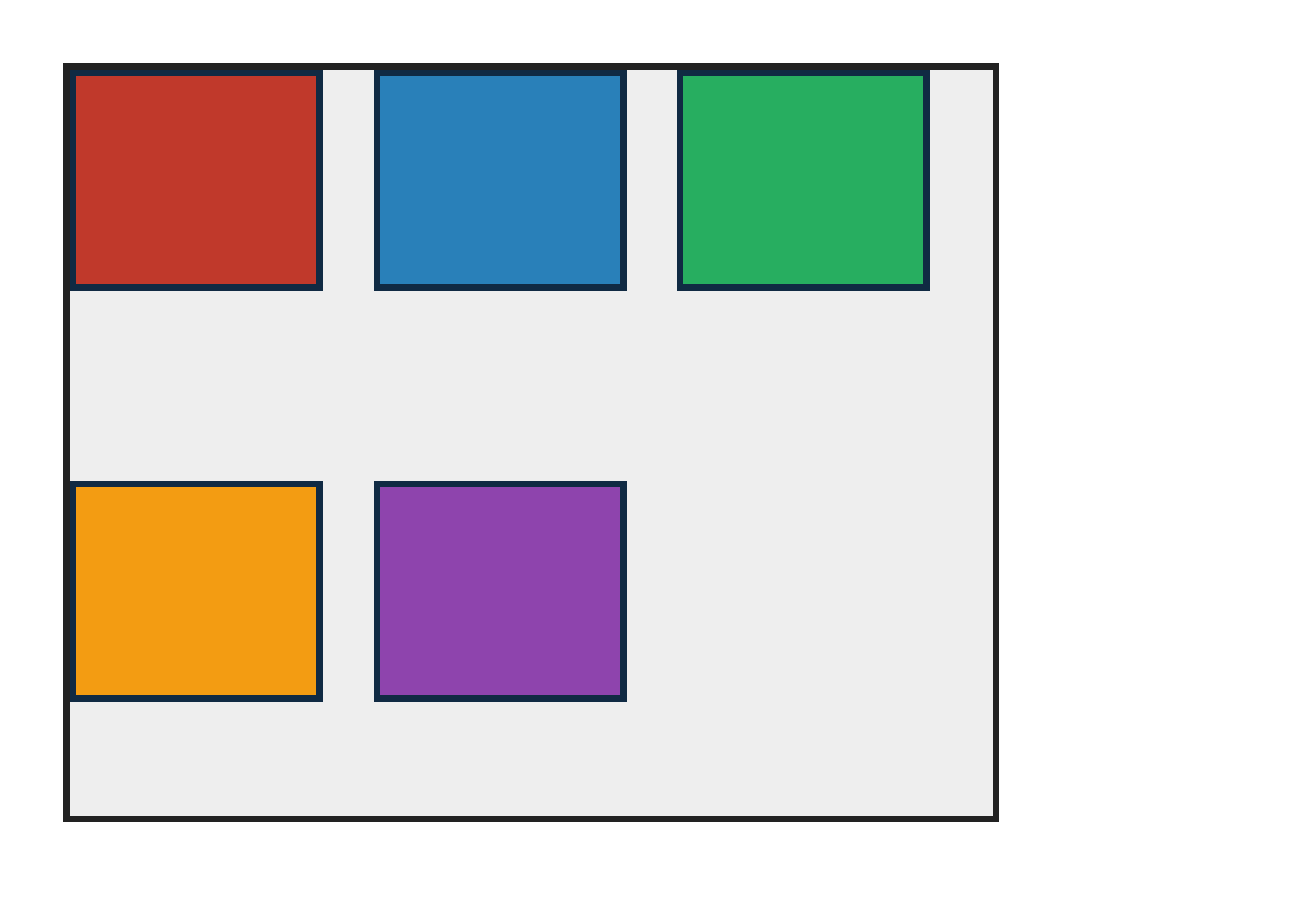
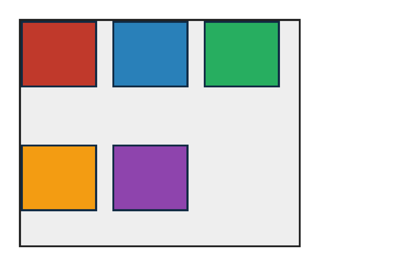
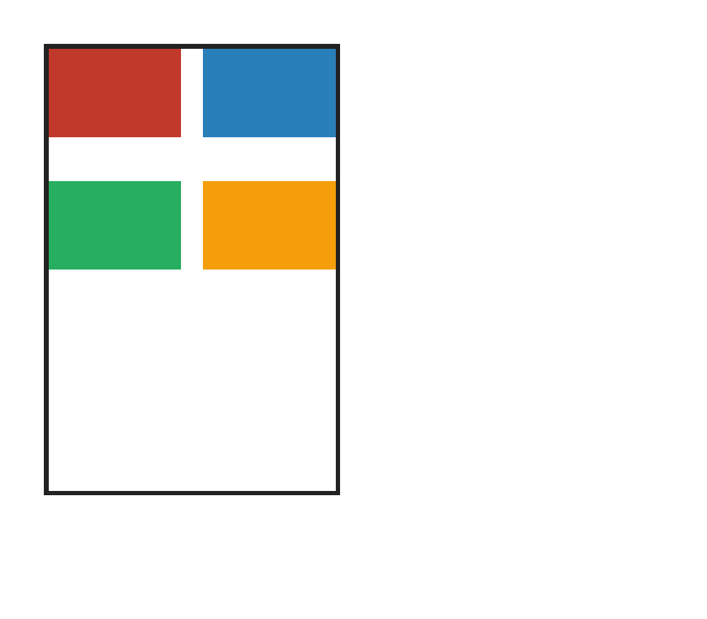
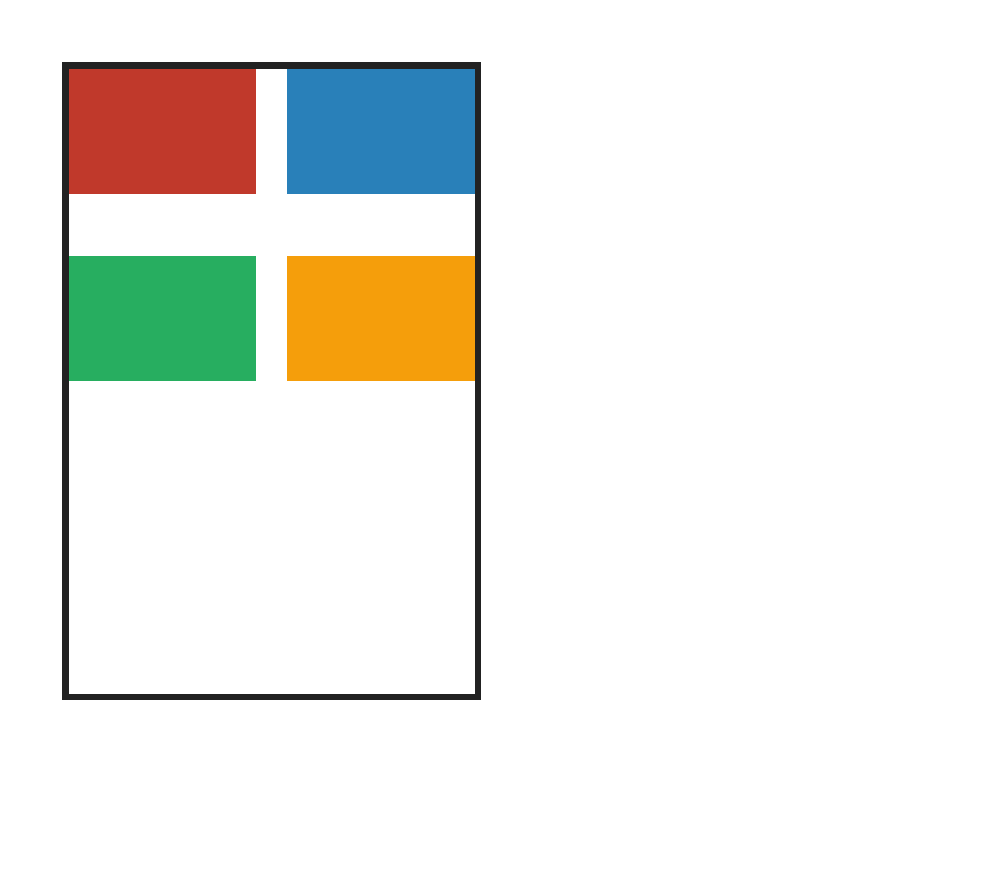
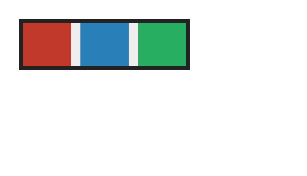
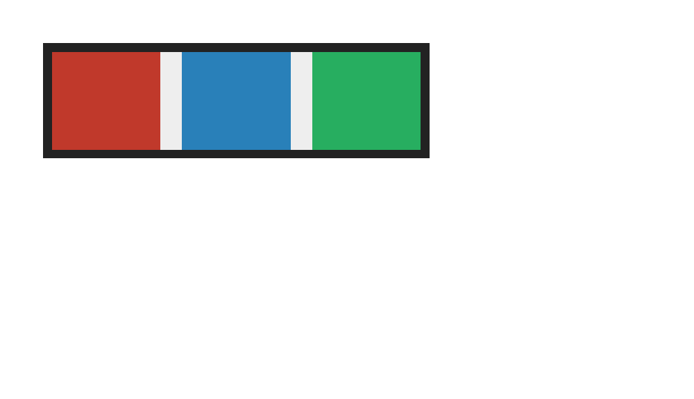
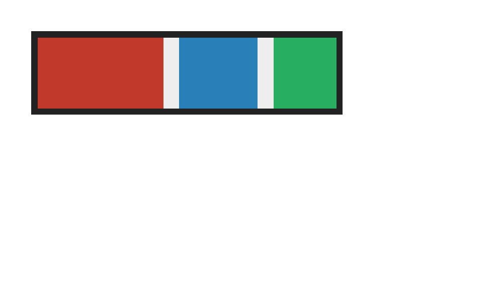
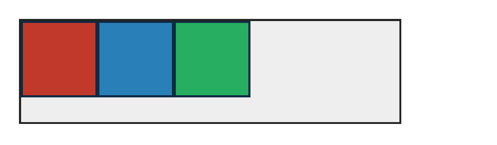
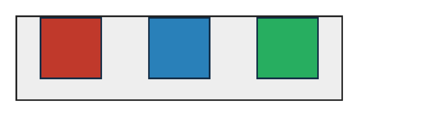
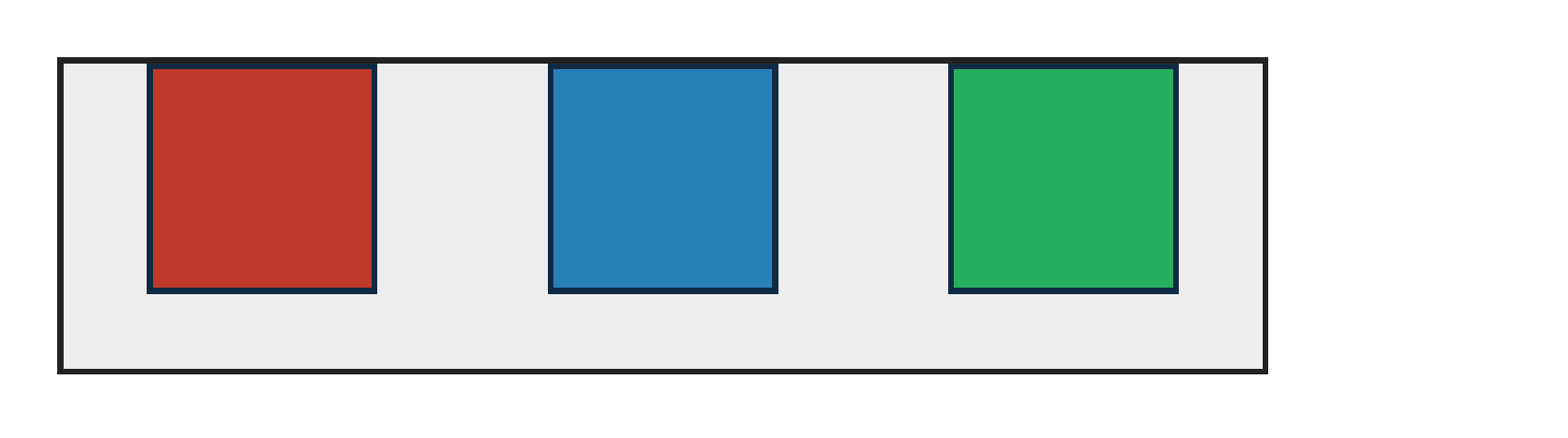
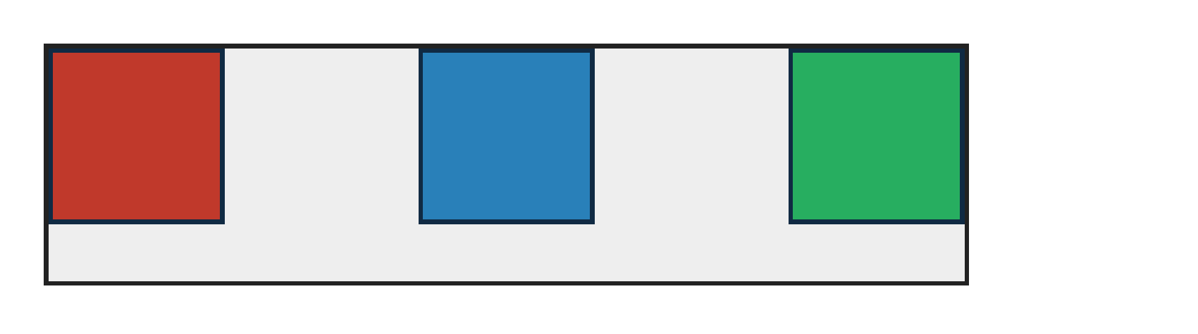
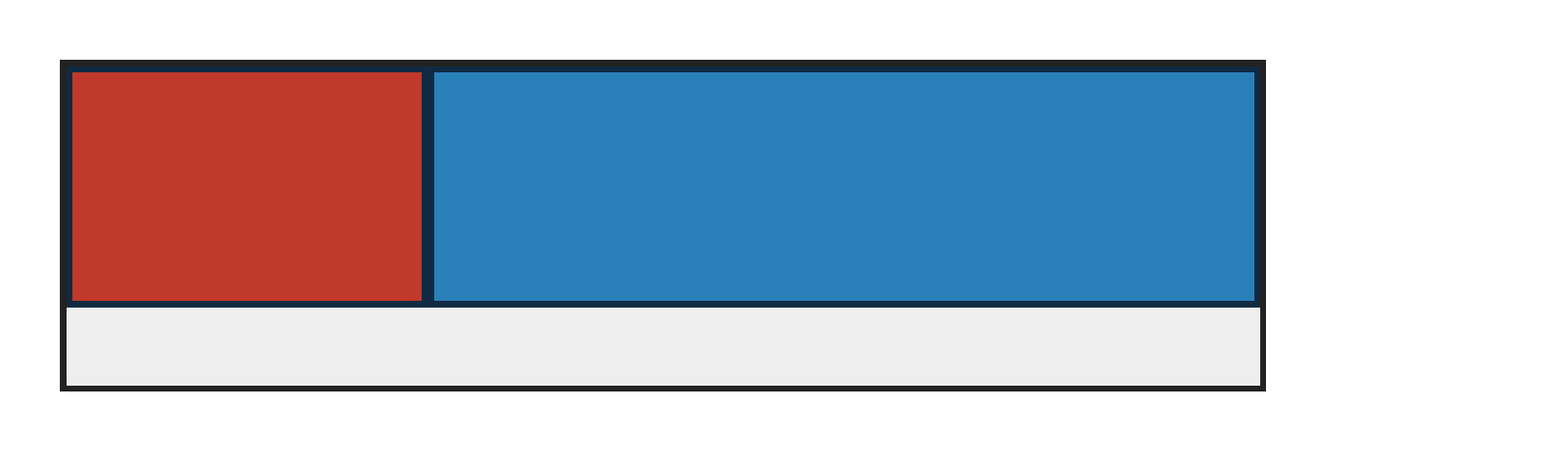
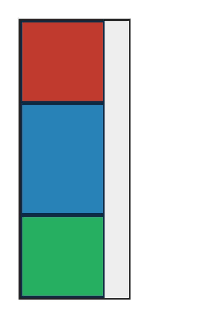
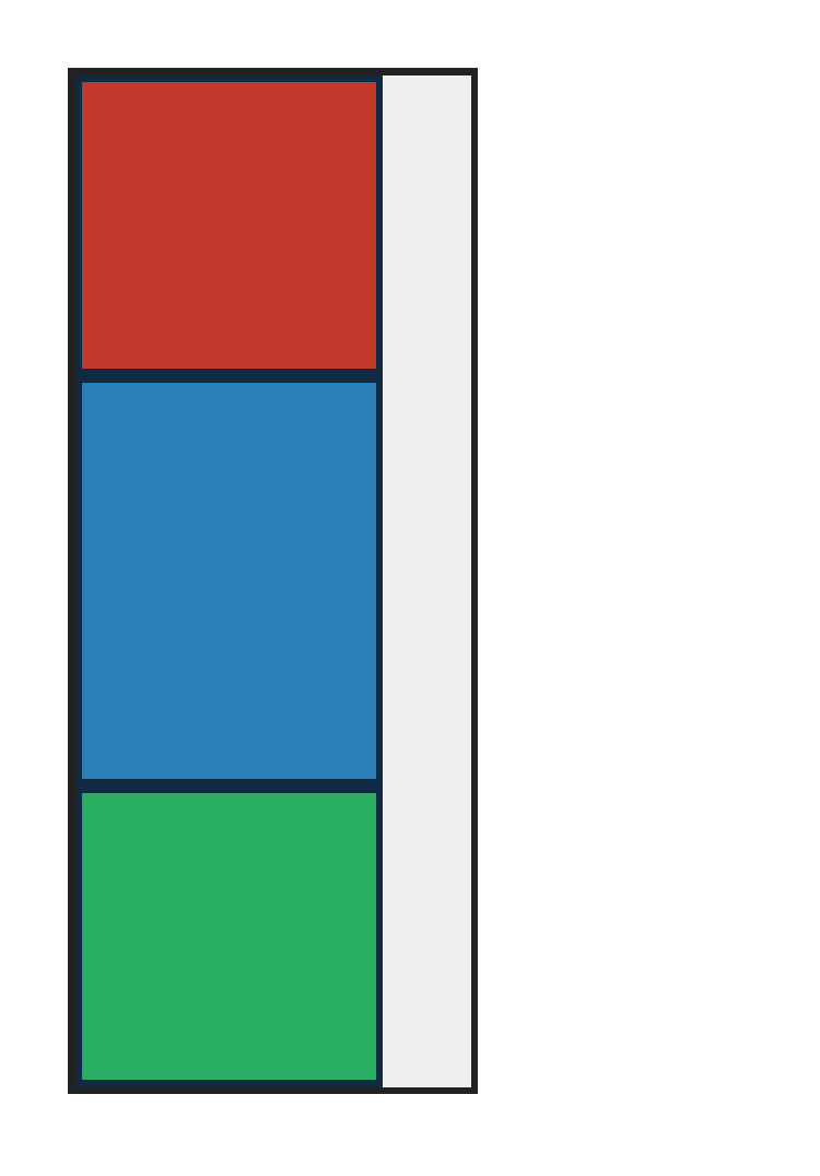
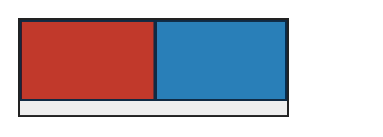
flexbox — 100.00% verified visual parity

← all categories · PASS 132 · FAIL 0 · REFERENCE-DISPUTED 0 · 132 total · 300 DPI

diff colours:MissingExtraColorErrMatchFull-page diff: matching and per-channel ≤1.0% pixels are blank; coloured classes are same-coordinate above-floor evidence. Exact RGBA mismatch remains numeric.

absolute-positioning — 100.00% verified visual parity PASS 1 · FAIL 0 · REFERENCE-DISPUTED 0all categories ↑

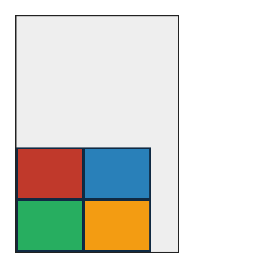
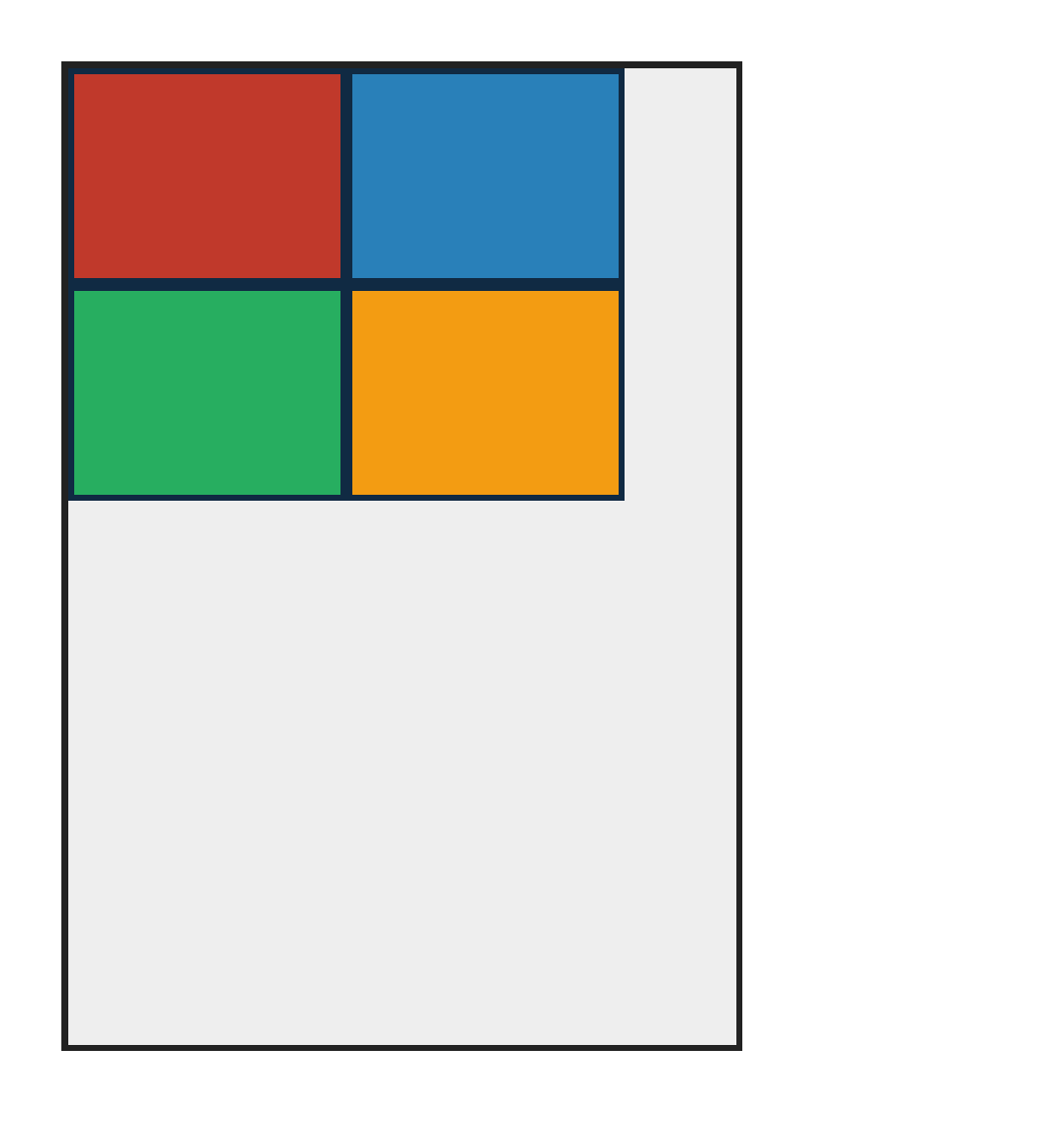
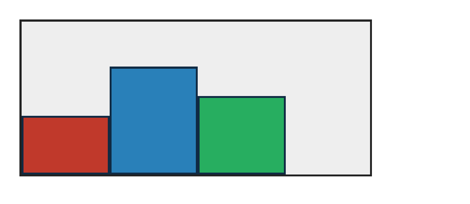
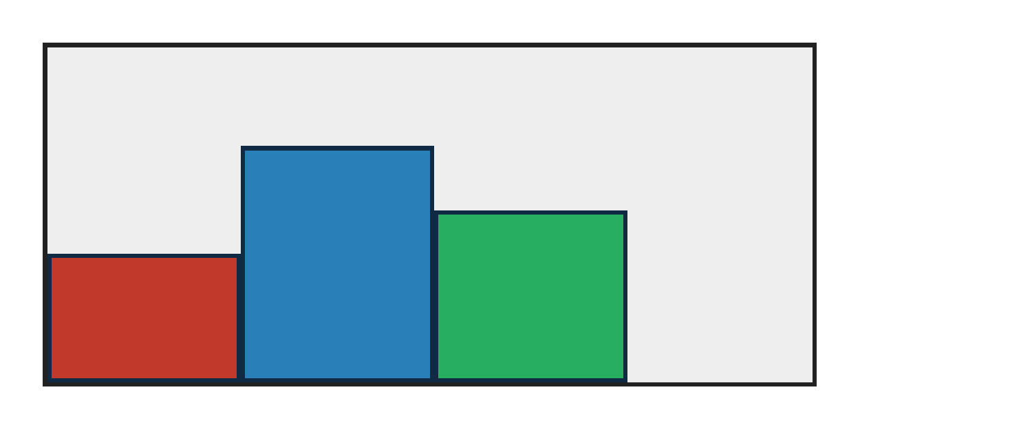
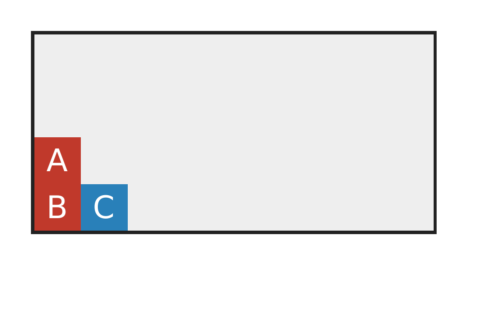
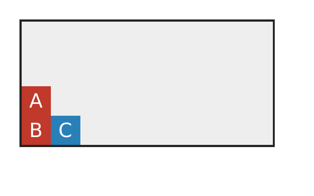
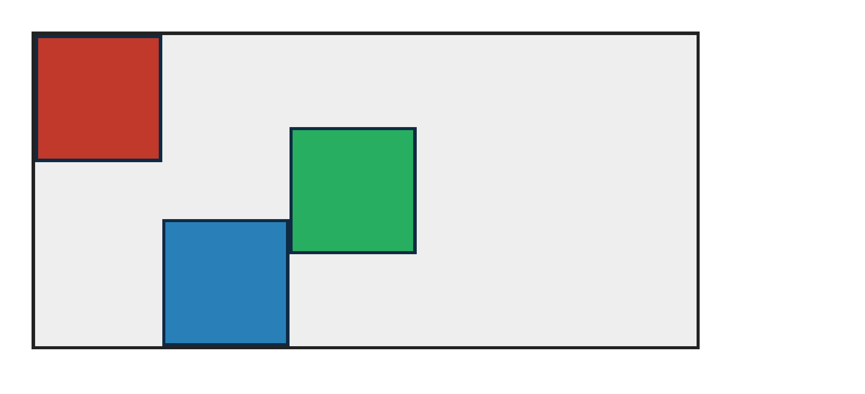
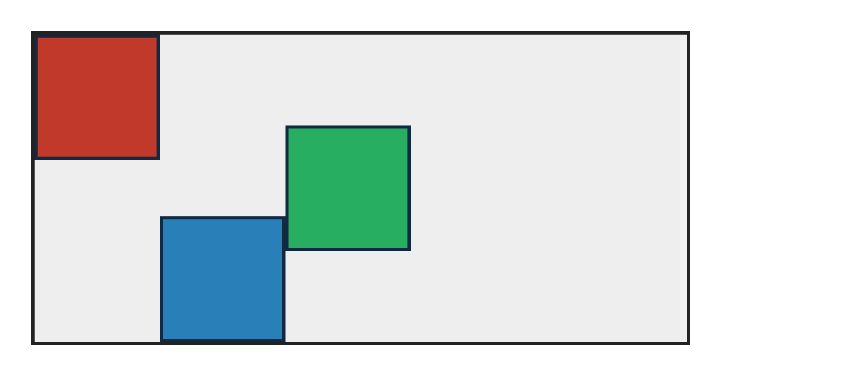
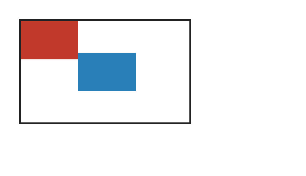
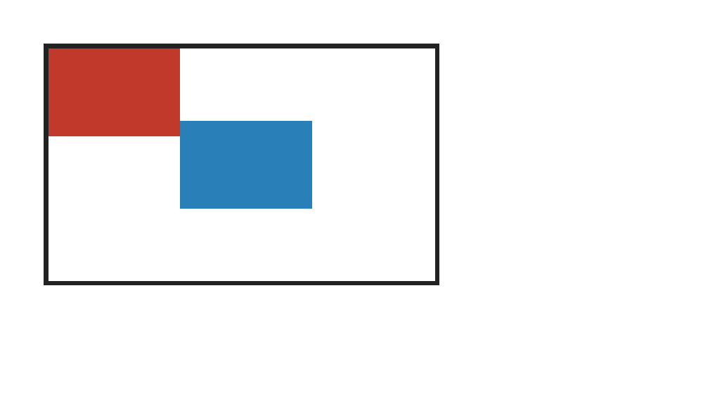
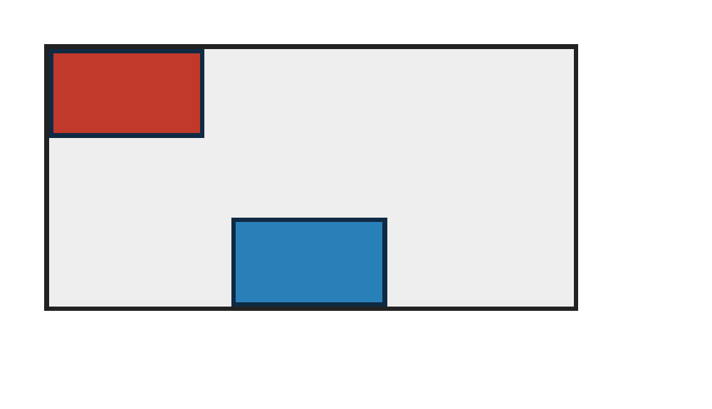
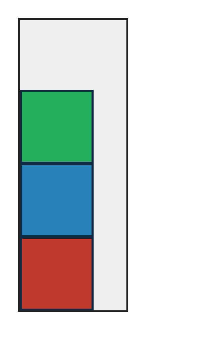
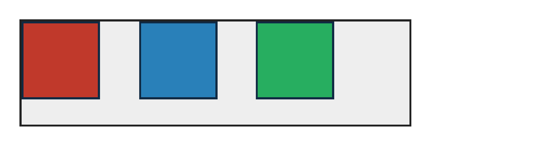
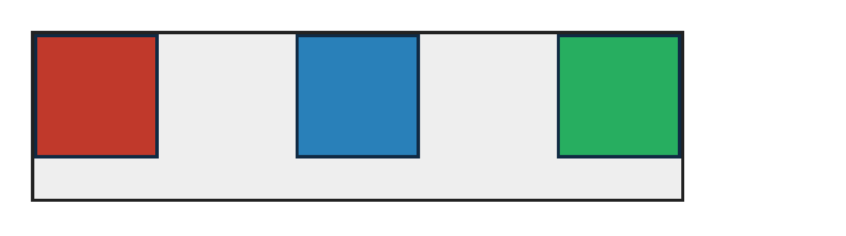
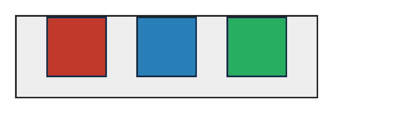
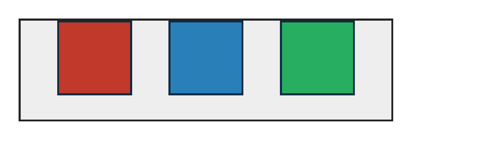
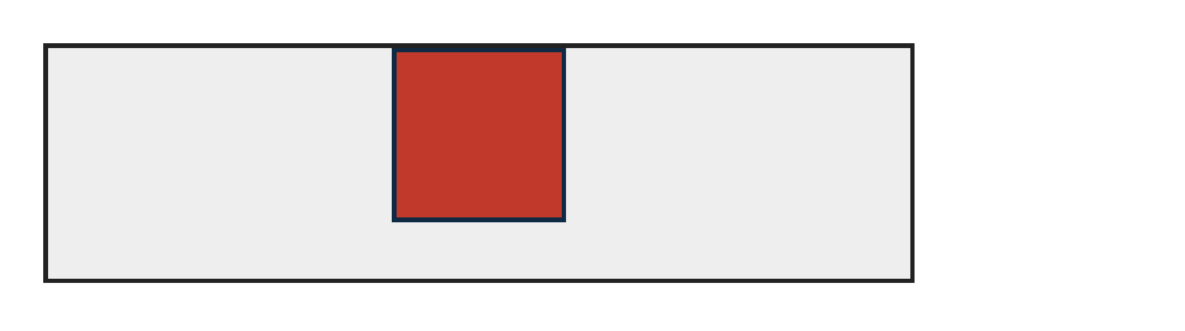
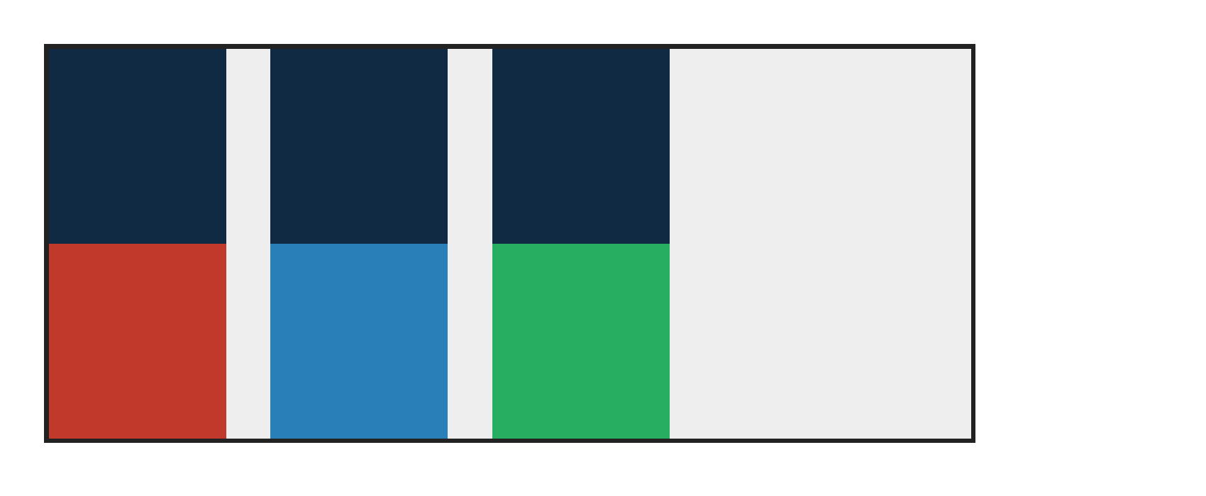
PASS exact match flexbox-abspos-order-paint · order-painting
Chrome ref
Chrome ref
ironpress
ironpress
full-page >1.0%/channel diff
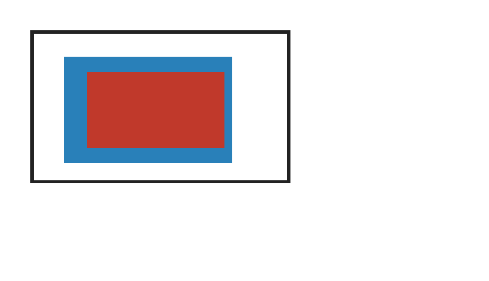
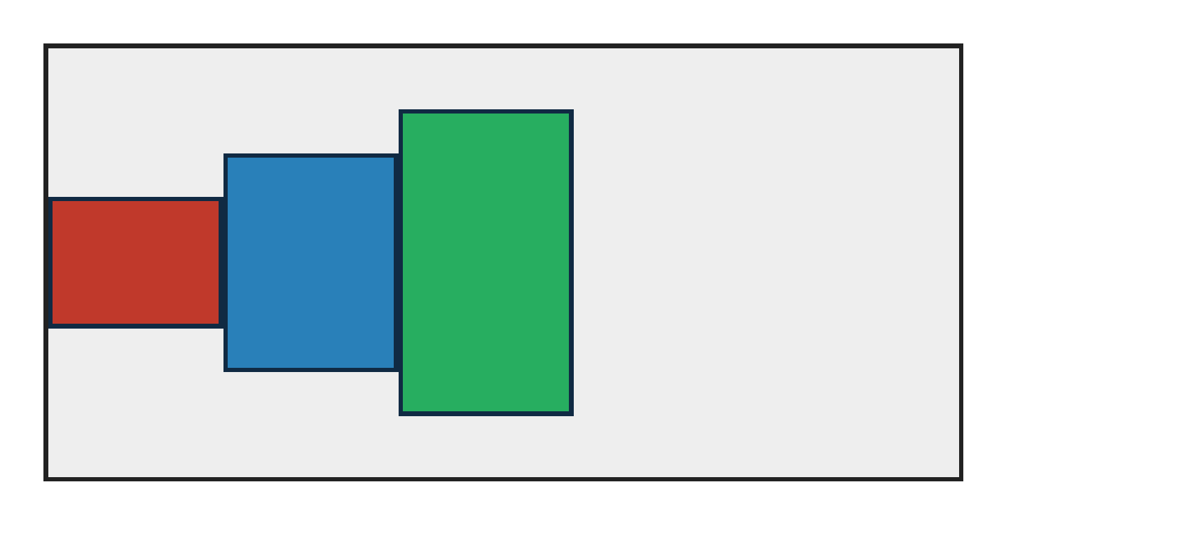
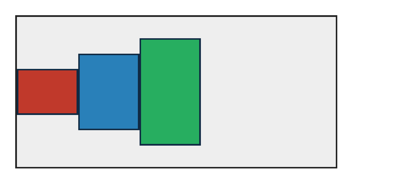
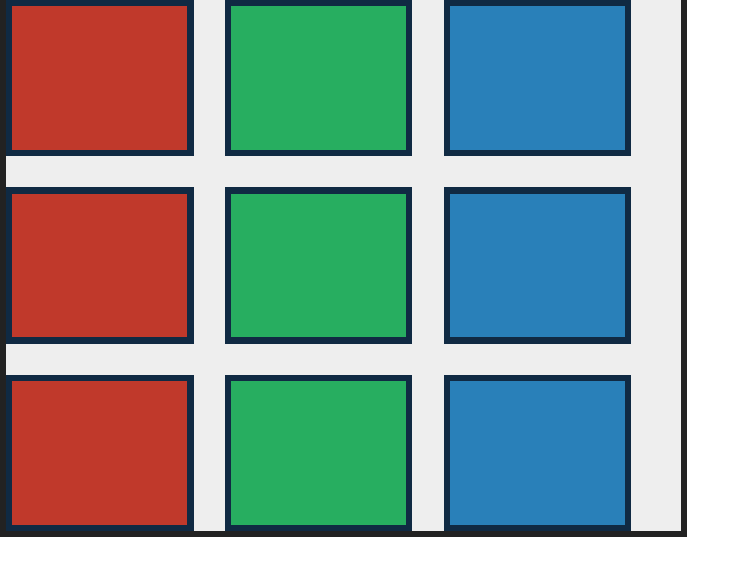
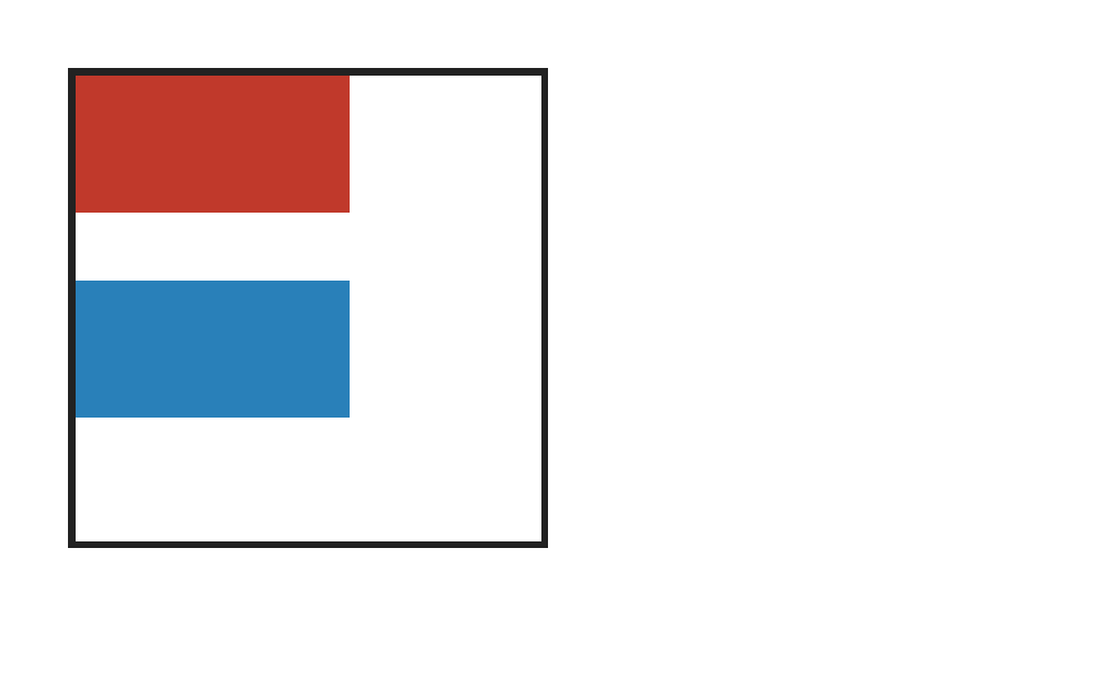
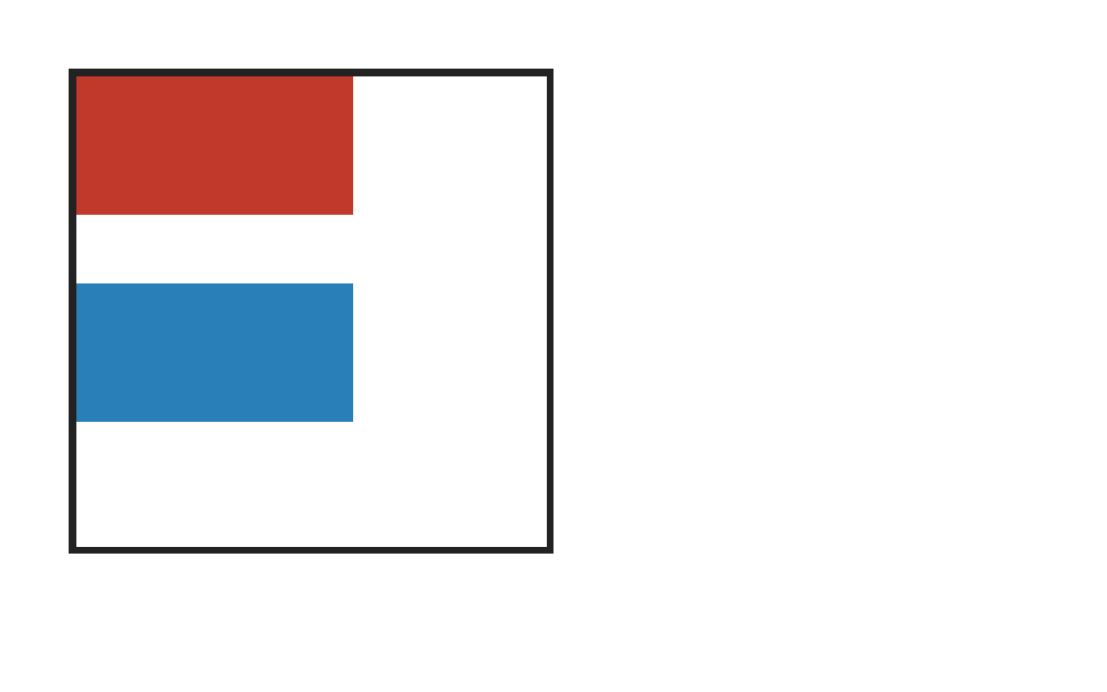
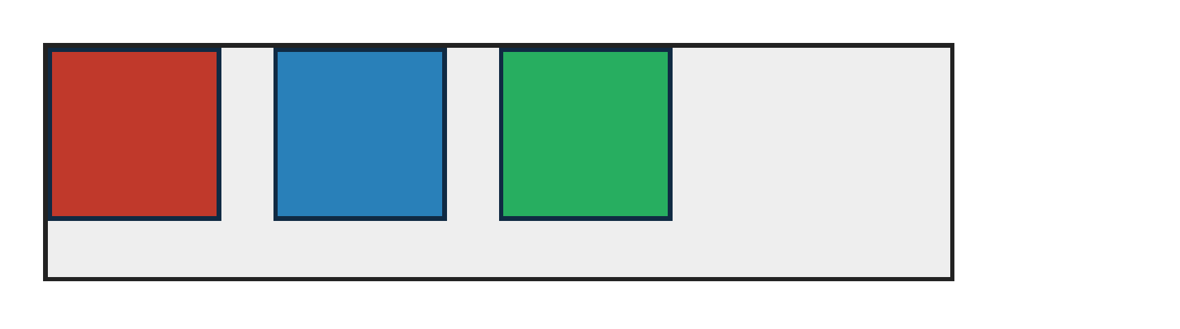
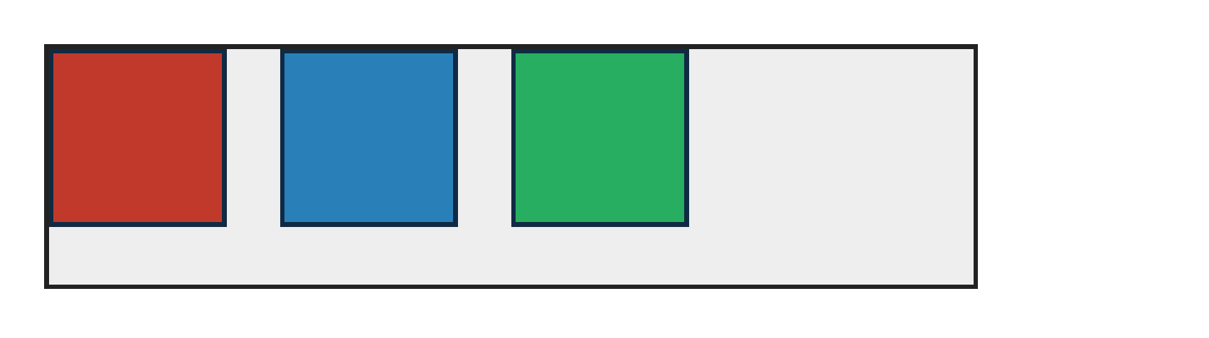
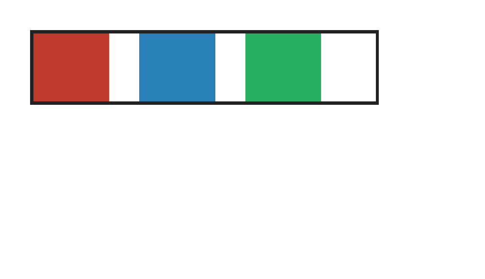
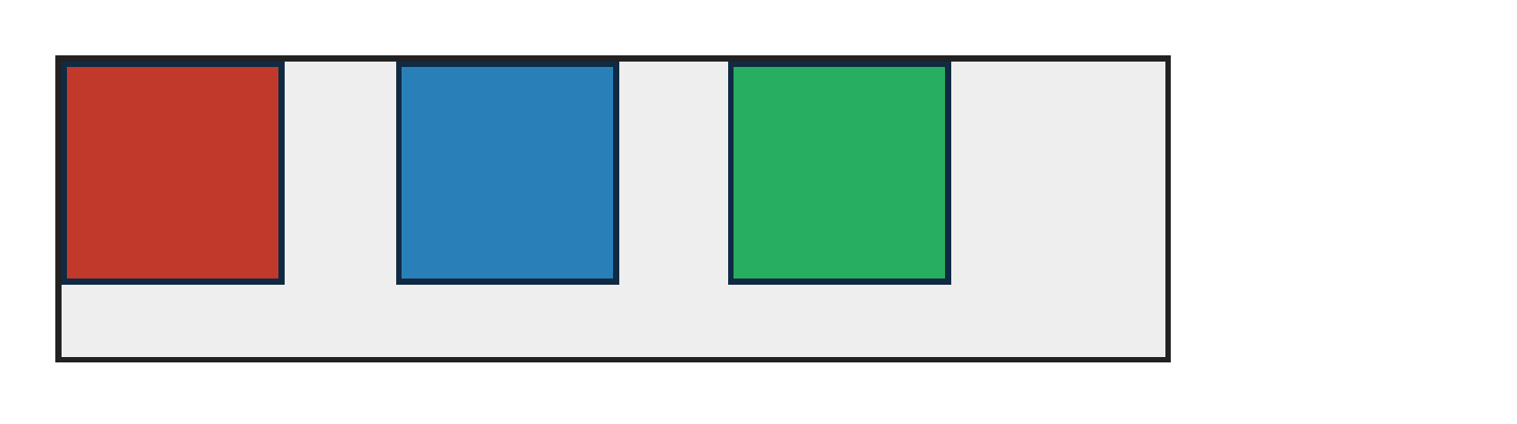
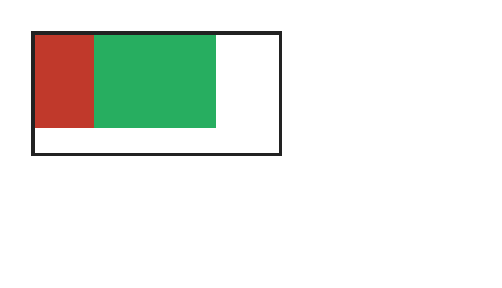
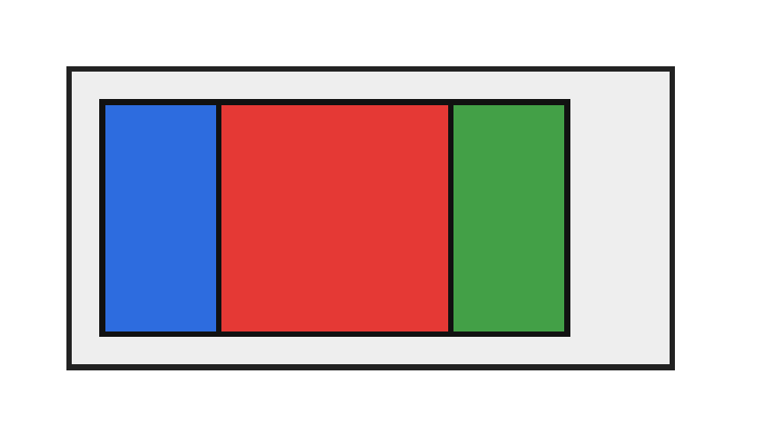
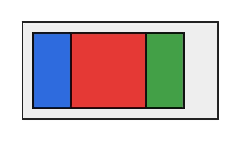
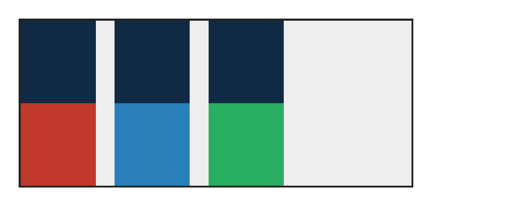
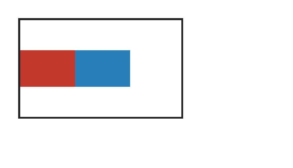
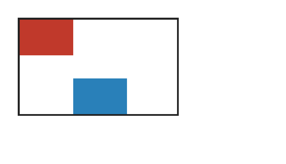
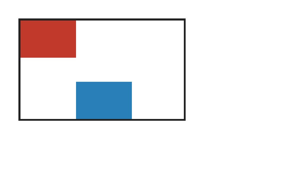
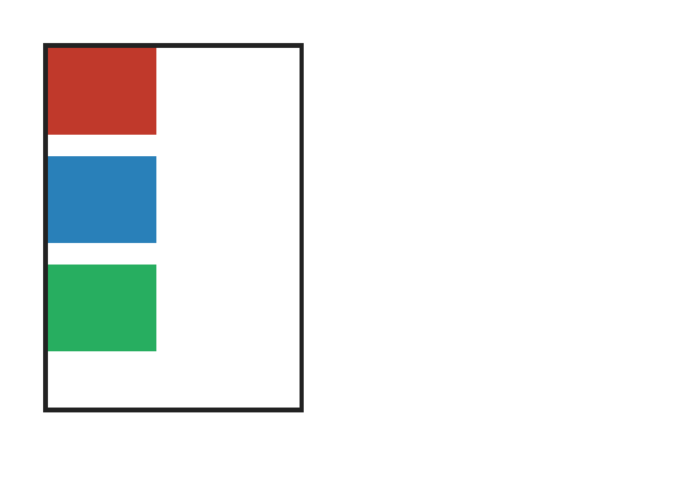
An absolutely positioned flex child paints as order:0 relative to ordered flex items; catches renderers that append all absolute children above flex content.
abspos-flex-child — 100.00% verified visual parity PASS 1 · FAIL 0 · REFERENCE-DISPUTED 0all categories ↑

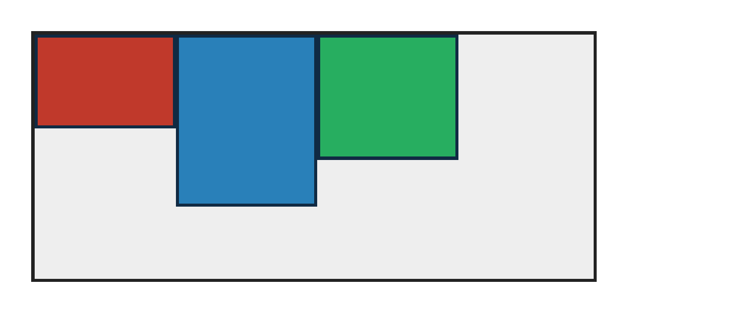
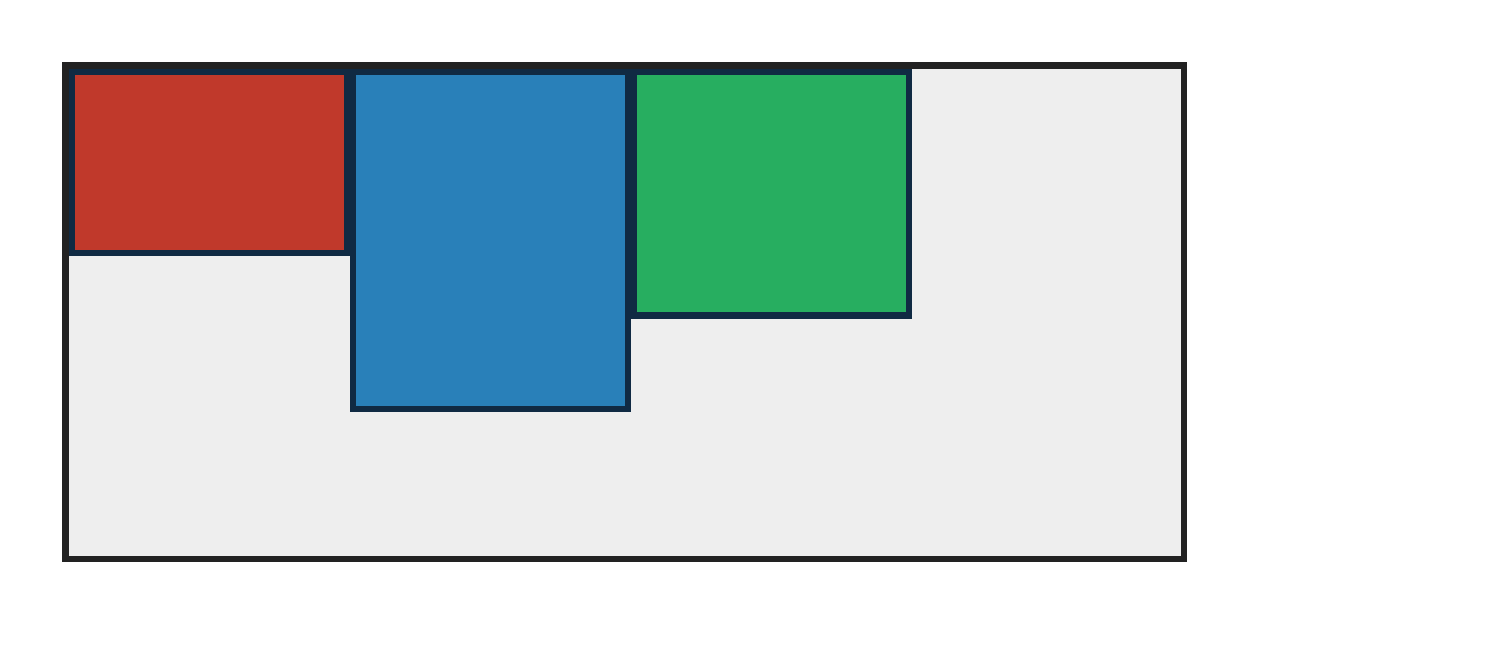
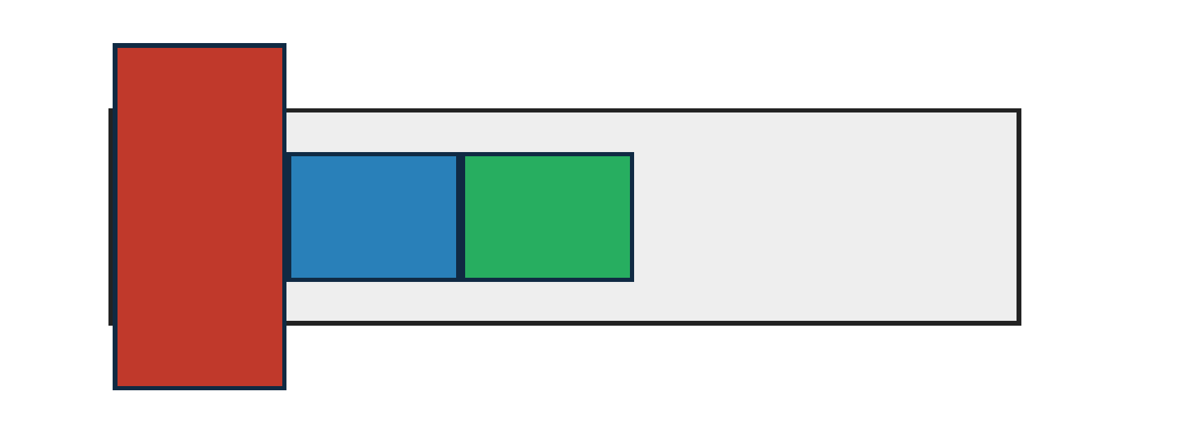
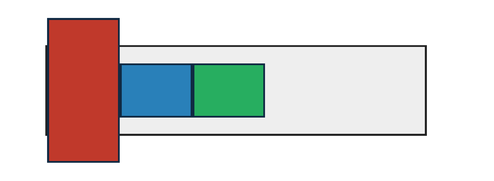
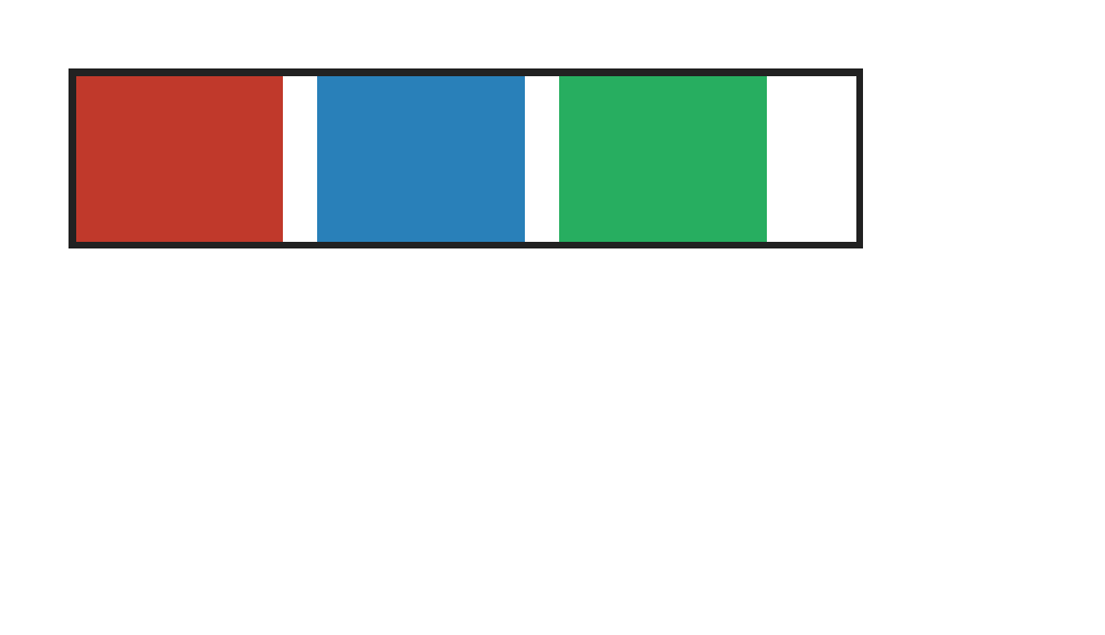
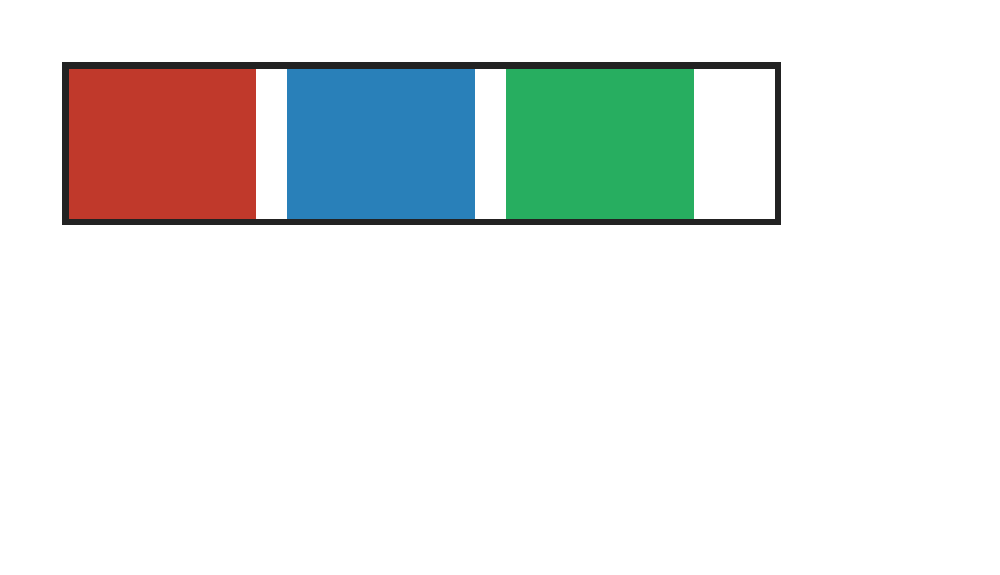
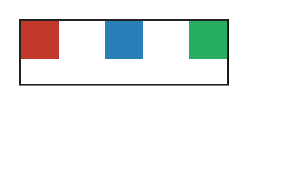
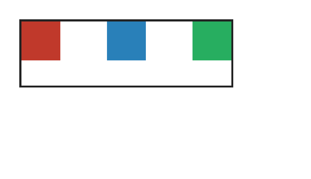
PASS exact match flexbox-abspos-static-position · static-position-alignment
Chrome ref
Chrome ref
ironpress
ironpress
full-page >1.0%/channel diff
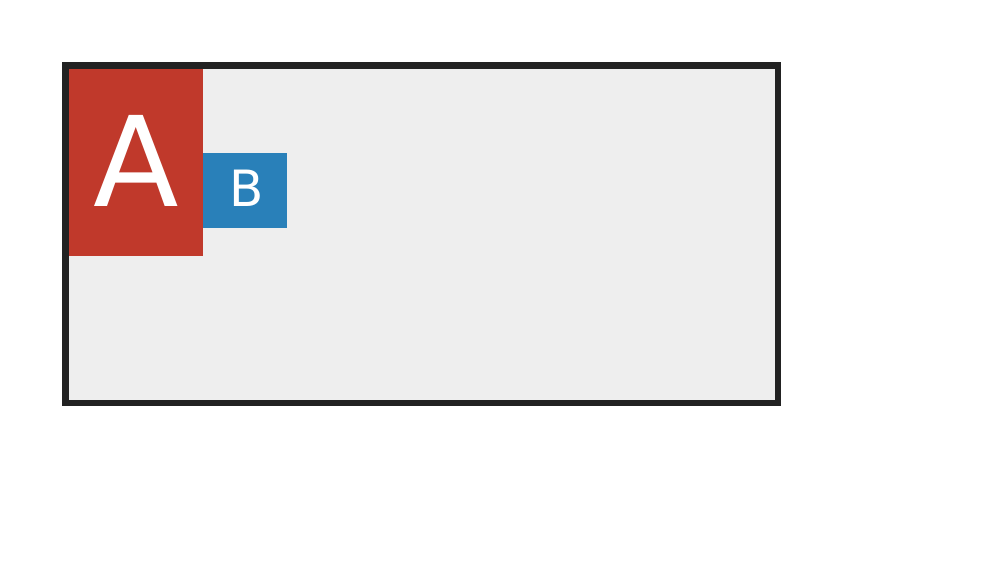
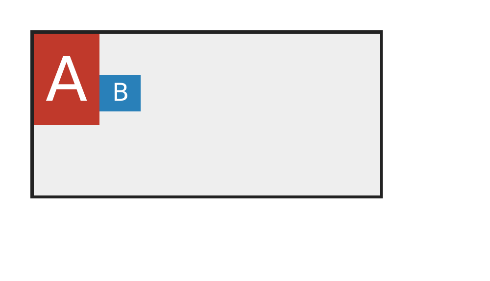
An absolutely positioned flex child with auto insets uses the flex static-position rectangle from justify-content and align-self; catches anchoring at the padding-box origin.

align-content — 100.00% verified visual parity PASS 11 · FAIL 0 · REFERENCE-DISPUTED 0all categories ↑

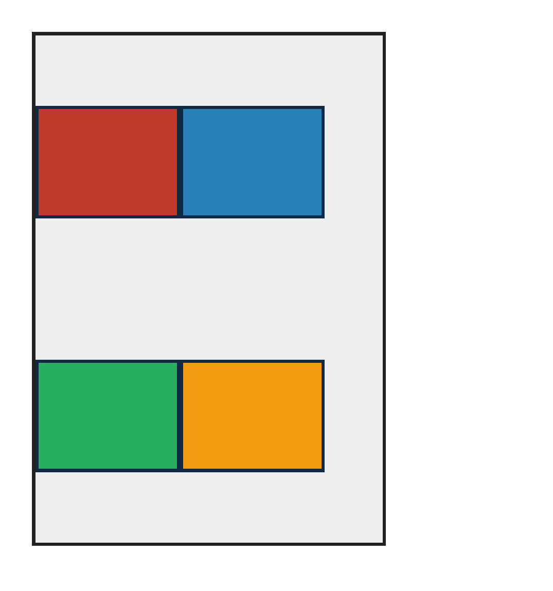
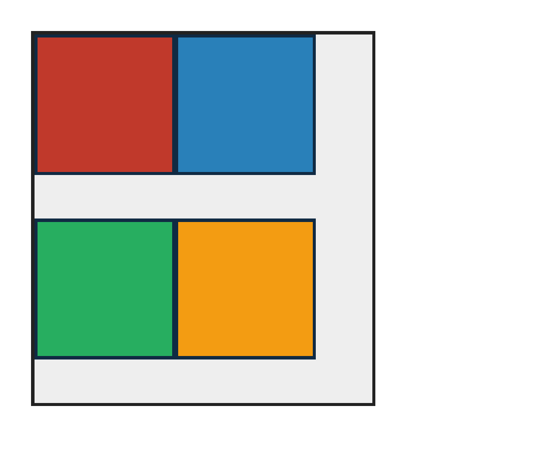
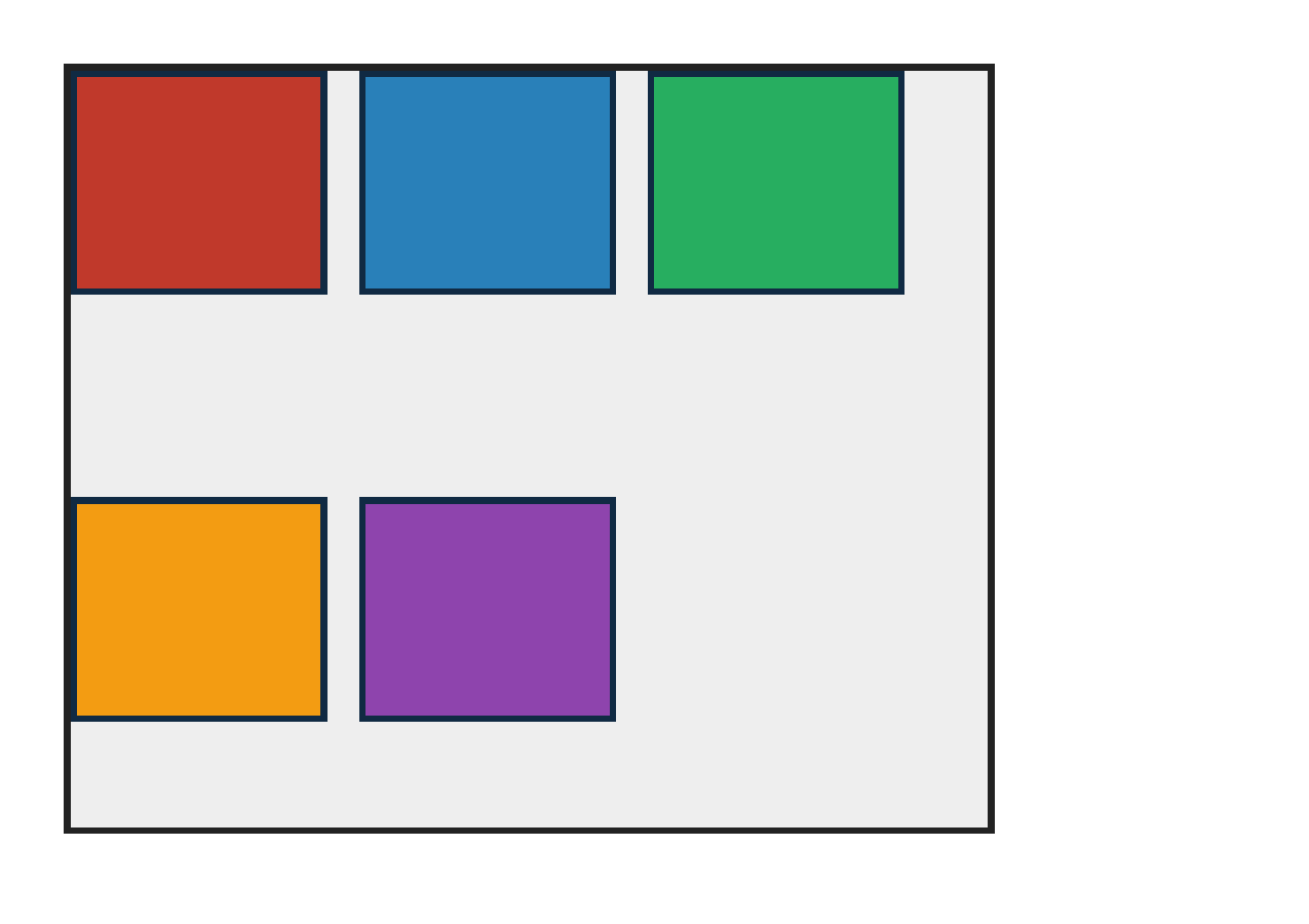
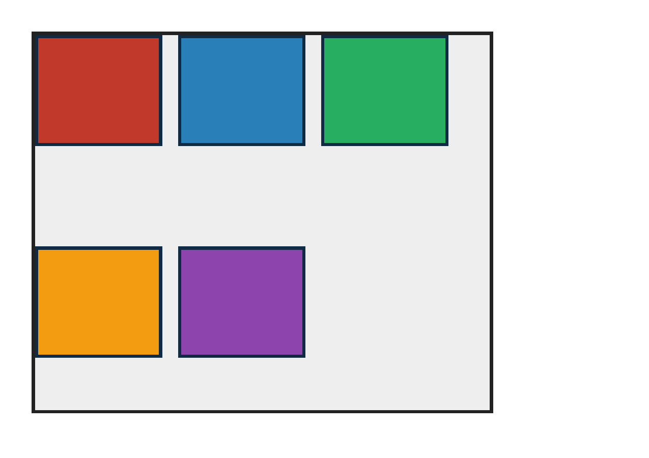
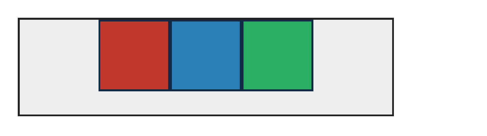
PASS exact match flexbox-align-content-center · center
Chrome ref
Chrome ref
ironpress
ironpress
full-page >1.0%/channel diff
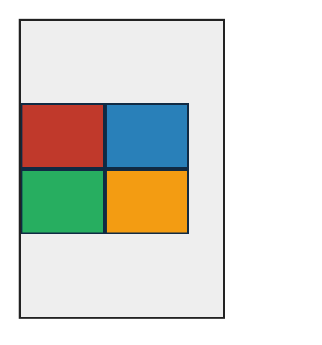
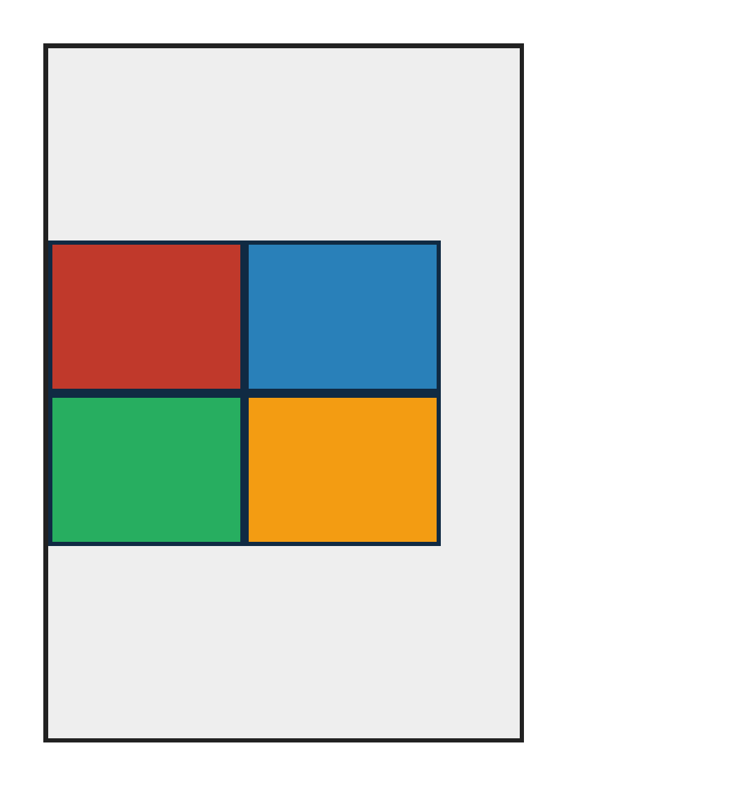
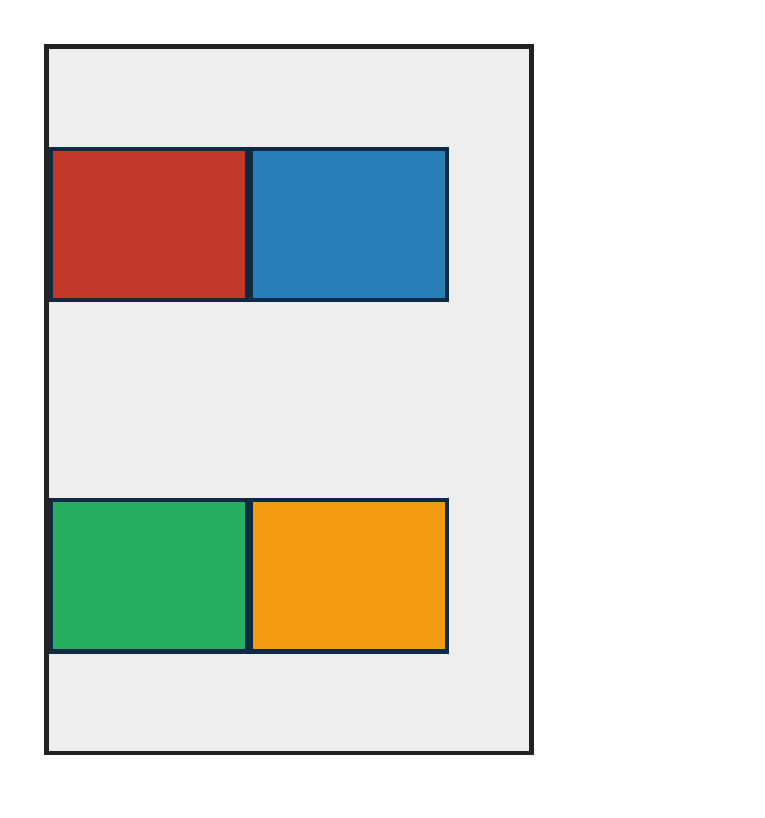
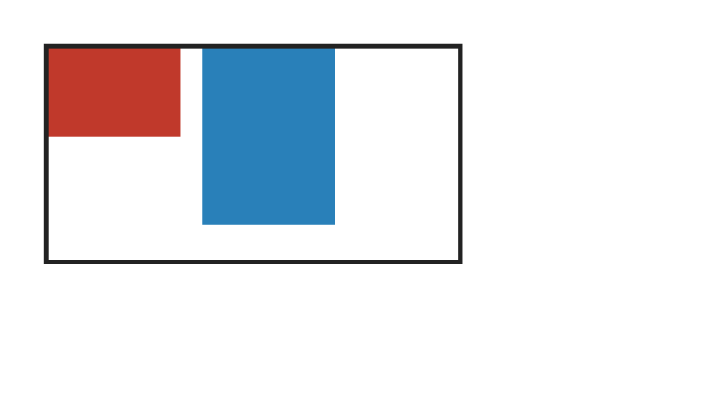
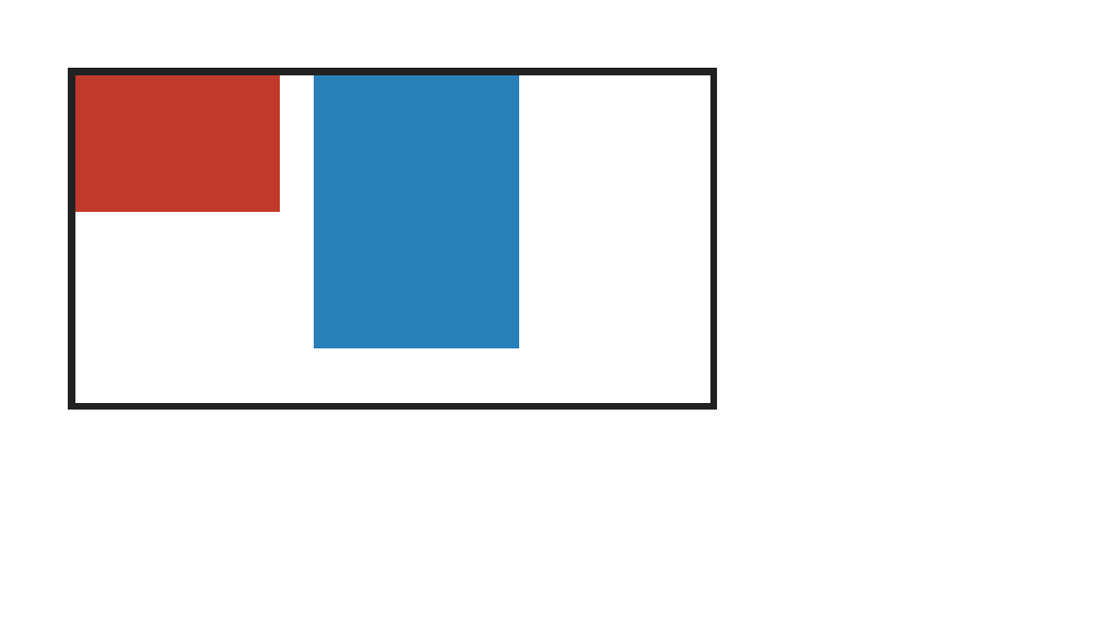
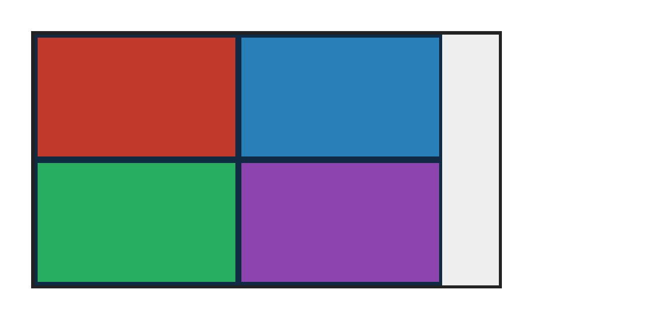
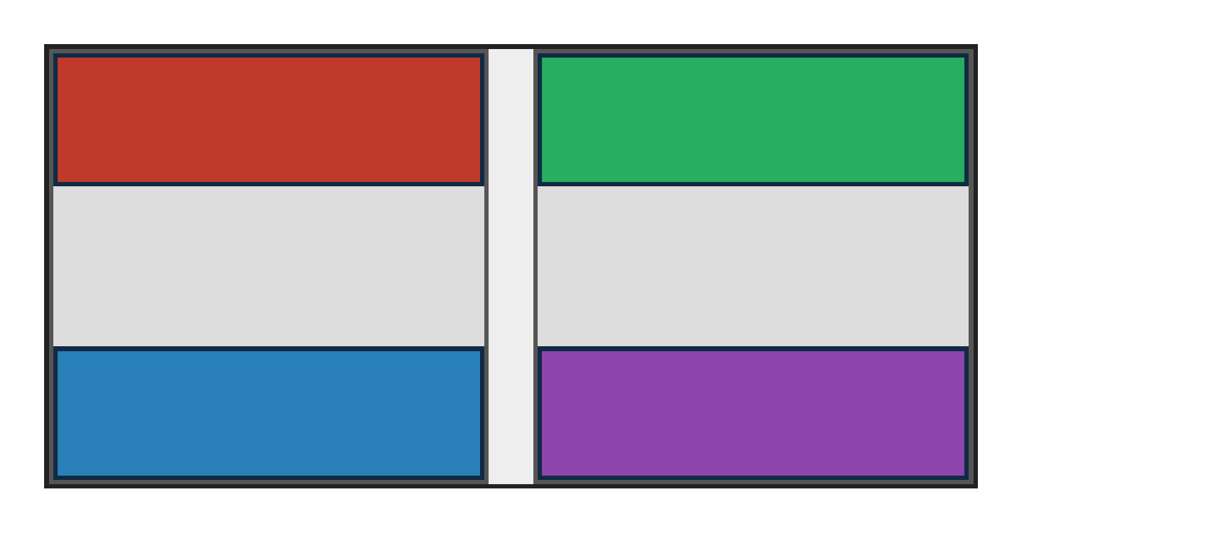
align-content:center centers the wrapped flex lines on the cross axis.
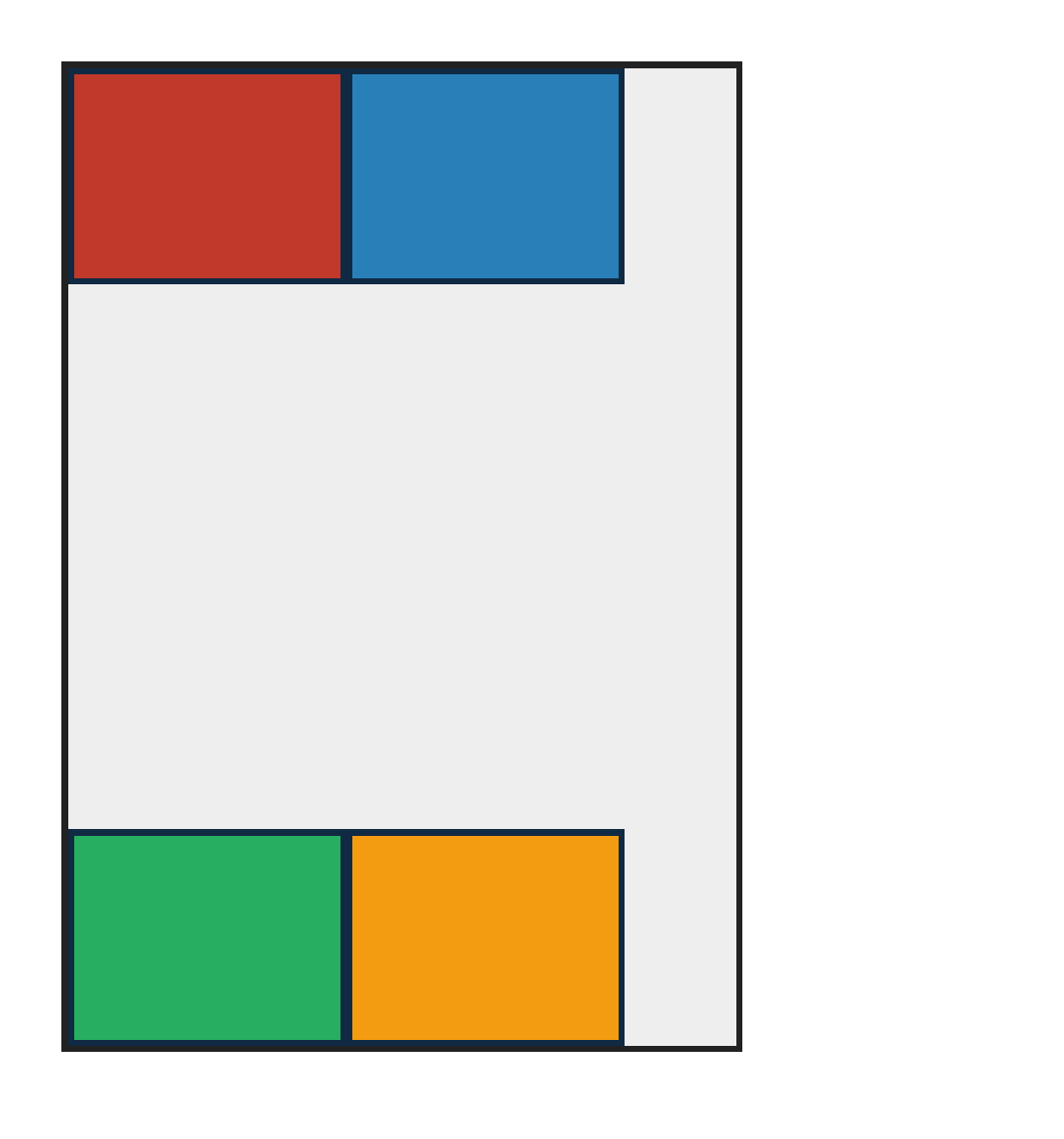
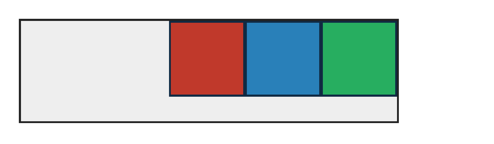
PASS exact match flexbox-align-content-flex-end · flex-end
Chrome ref
Chrome ref
ironpress
ironpress
full-page >1.0%/channel diff
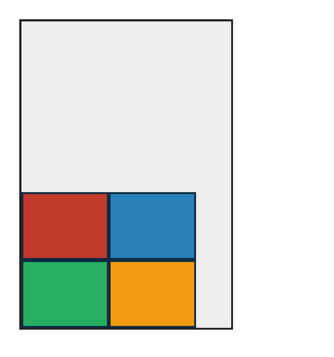
align-content:flex-end packs the wrapped flex lines to the cross-end edge.
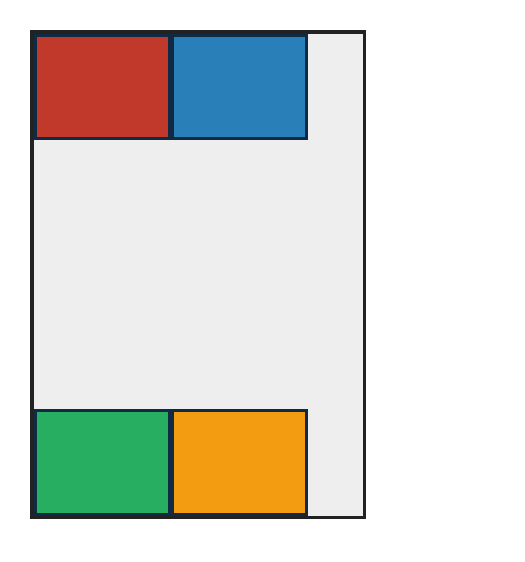
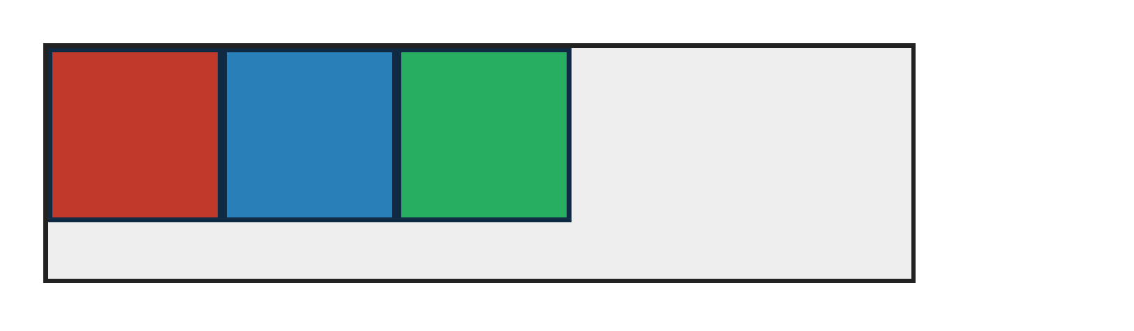
PASS exact match flexbox-align-content-flex-start · flex-start
Chrome ref
Chrome ref
ironpress
ironpress
full-page >1.0%/channel diff
align-content:flex-start packs the wrapped flex lines to the cross-start edge.
PASS exact match flexbox-align-content-safe-center · safe-center
Chrome ref
Chrome ref
ironpress
ironpress
full-page >1.0%/channel diff
align-content:safe center centers wrapped flex lines when they fit; catches parsers that reject safe center and fall back to stretch.
PASS exact match flexbox-align-content-single-line-noop · single-line-noop
Chrome ref
Chrome ref
ironpress
ironpress
full-page >1.0%/channel diff
align-content:flex-end has no effect on a nowrap single-line flex container; catches implementations that move the only line to cross-end.
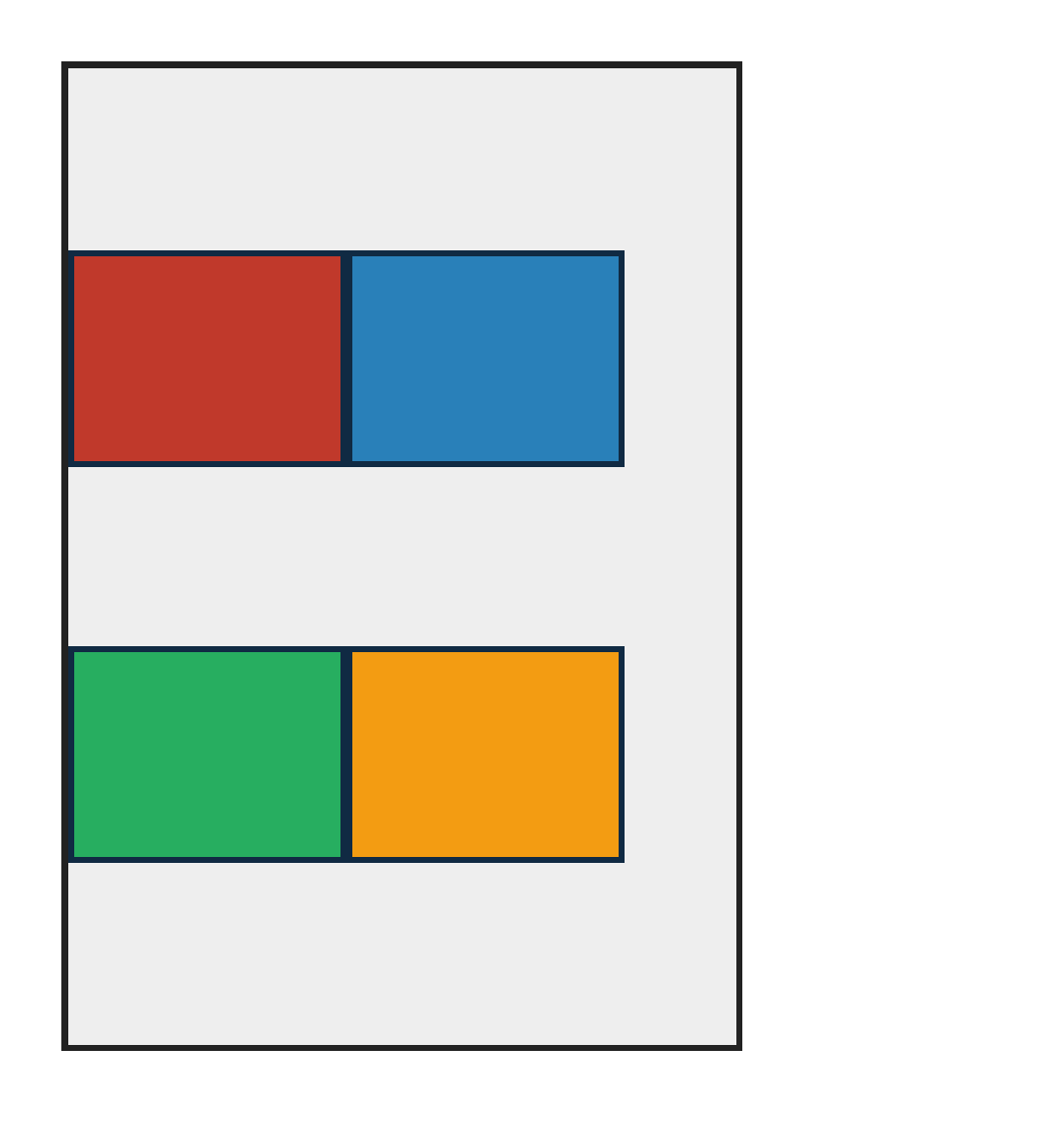
PASS exact match flexbox-align-content-space-around · space-around
Chrome ref
Chrome ref
ironpress
ironpress
full-page >1.0%/channel diff
align-content:space-around gives each wrapped line equal surrounding space (half at edges).
PASS exact match flexbox-align-content-space-between · space-between
Chrome ref
Chrome ref
ironpress
ironpress
full-page >1.0%/channel diff
align-content:space-between pins the first and last lines to the edges with equal gaps between.
PASS exact match flexbox-align-content-space-evenly · space-evenly
Chrome ref
Chrome ref
ironpress
ironpress
full-page >1.0%/channel diff
align-content:space-evenly distributes equal space between lines and at both cross edges.
PASS exact match flexbox-align-content-stretch · stretch
Chrome ref
Chrome ref
ironpress
ironpress
full-page >1.0%/channel diff
align-content:stretch grows the wrapped flex lines to fill the extra cross-axis space.
PASS exact match flexbox-align-content-wrap-reverse-edge · wrap-reverse-edge
Chrome ref
Chrome ref
ironpress
ironpress
full-page >1.0%/channel diff
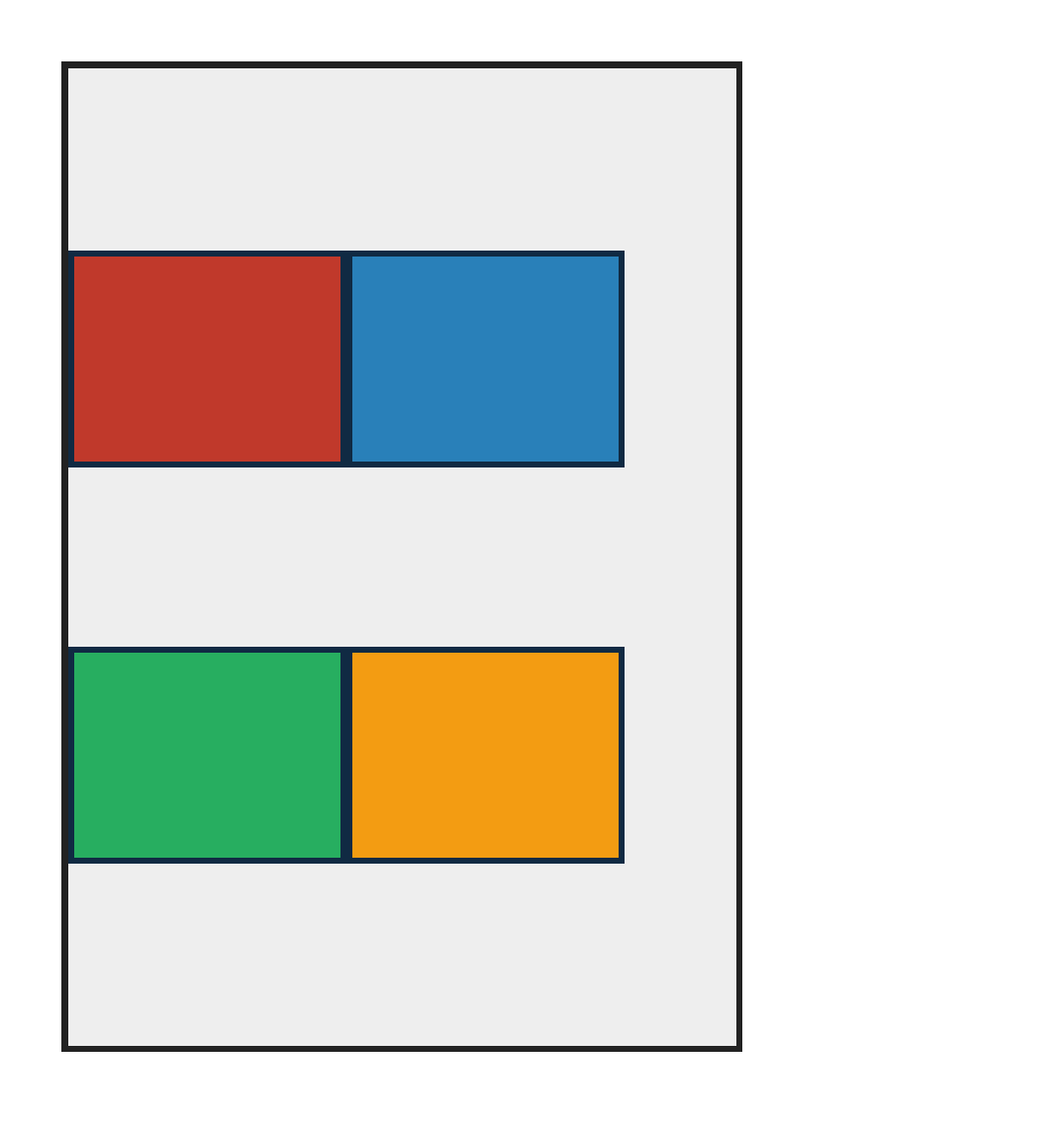
flex-wrap:wrap-reverse swaps the cross-start/cross-end edges, so align-content:flex-start packs the flex lines toward the bottom with reversed line order (css-flexbox-1 §5.3, §8.4).
PASS exact match flexbox-column-wrap-align-content · column-wrap-space-between
Chrome ref
Chrome ref
ironpress
ironpress
full-page >1.0%/channel diff
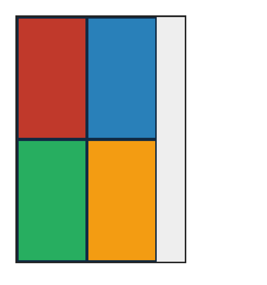
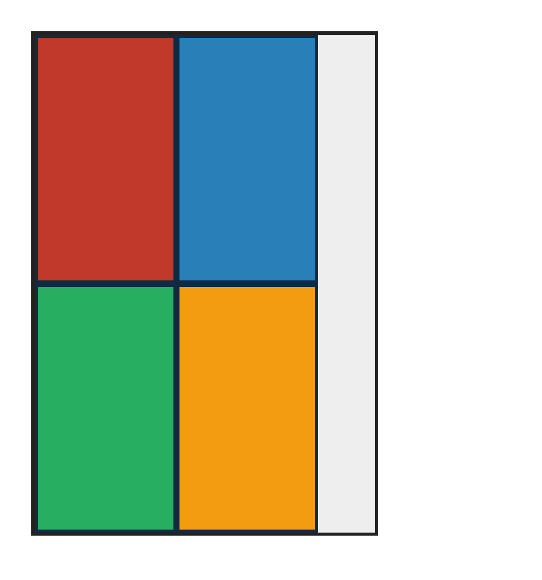
align-content:space-between distributes wrapped column flex lines to the left and right edges; catches row-only align-content code that packs column-wrap lines together.

align-items — 100.00% verified visual parity PASS 13 · FAIL 0 · REFERENCE-DISPUTED 0all categories ↑

PASS exact match flexbox-align-items-baseline · baseline
Chrome ref
Chrome ref
ironpress
ironpress
full-page >1.0%/channel diff
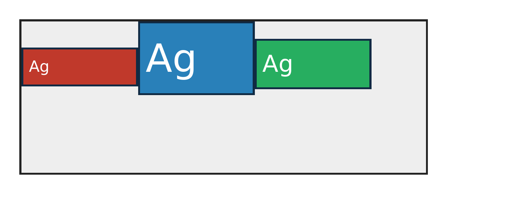
align-items:baseline aligns the first text baselines of differently-sized items.
PASS exact match flexbox-align-items-center · center
Chrome ref
Chrome ref
ironpress
ironpress
full-page >1.0%/channel diff
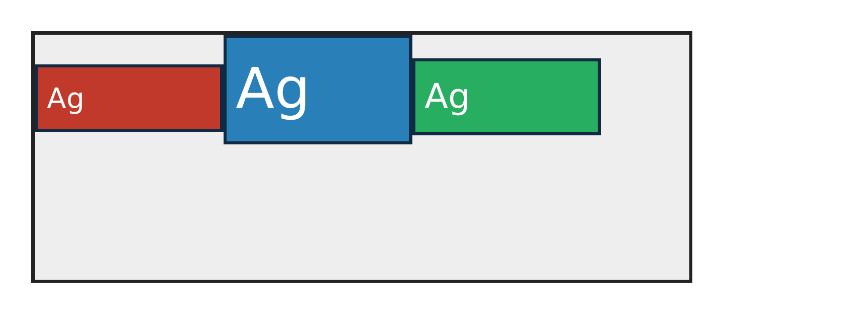
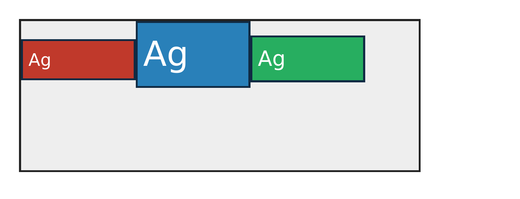
align-items:center centers differently-tall boxes on the cross axis of a fixed-height row container.
PASS exact match flexbox-align-items-first-baseline · first-baseline
Chrome ref
Chrome ref
ironpress
ironpress
full-page >1.0%/channel diff
align-items:first baseline parses as baseline alignment for differently sized text flex items; catches fallback to stretch or cross-start.
PASS exact match flexbox-align-items-flex-end · flex-end
Chrome ref
Chrome ref
ironpress
ironpress
full-page >1.0%/channel diff
align-items:flex-end anchors differently-tall items to the cross-end (bottom) edge.
PASS exact match flexbox-align-items-flex-start · flex-start
Chrome ref
Chrome ref
ironpress
ironpress
full-page >1.0%/channel diff
align-items:flex-start anchors differently-tall items to the cross-start (top) edge.
PASS exact match flexbox-align-items-last-baseline · last-baseline
Chrome ref
Chrome ref
ironpress
ironpress
full-page >1.0%/channel diff
align-items:last baseline aligns a one-line item's baseline with the last baseline of a two-line flex item; catches unsupported last-baseline parsing.
PASS exact match flexbox-align-items-min-height · min-height
Chrome ref
Chrome ref
ironpress
ironpress
full-page >1.0%/channel diff
A non-stretch (align-items:center) item honors its min-height and overflows the shorter container line symmetrically (css-flexbox-1 §9.4 step 11).
PASS exact match flexbox-align-items-safe-center · safe-center
Chrome ref
Chrome ref
ironpress
ironpress
full-page >1.0%/channel diff
align-items:safe center is equivalent to center when the item fits; catches parsers that reject the safe overflow-alignment prefix.
PASS exact match flexbox-align-items-stretch · stretch
Chrome ref
Chrome ref
ironpress
ironpress
full-page >1.0%/channel diff
align-items:stretch expands auto-height boxes to fill the cross-axis height of the container.
PASS exact match flexbox-align-items-stretch-max-height · stretch-max-height
Chrome ref
Chrome ref
ironpress
ironpress
full-page >1.0%/channel diff
align-items:stretch clamps the used cross size to the item's max-height (css-flexbox-1 §9.4 step 11): the capped item stays top-anchored at its max-height while its siblings stretch to the full container height.
PASS exact match flexbox-baseline-empty-synthesis · baseline-empty-item
Chrome ref
Chrome ref
ironpress
ironpress
full-page >1.0%/channel diff
align-items:baseline synthesizes a baseline for an empty fixed-size item rather than falling back to cross-start; catches baseline code that only handles text baselines.
PASS exact match flexbox-column-align-items-center · column-center
Chrome ref
Chrome ref
ironpress
ironpress
full-page >1.0%/channel diff
align-items:center in flex-direction:column centers fixed-width items on the horizontal cross axis; catches row-only cross-axis placement or unwanted stretch.
PASS exact match flexbox-invalid-align-items-preserves-prior-value · invalid-declaration-discard
Chrome ref
Chrome ref
ironpress
ironpress
full-page >1.0%/channel diff
A later invalid align-items declaration is discarded, so the earlier flex-end value continues to align the item at the cross end.

align-self — 100.00% verified visual parity PASS 4 · FAIL 0 · REFERENCE-DISPUTED 0all categories ↑

PASS exact match flexbox-align-self-baseline · baseline
Chrome ref
Chrome ref
ironpress
ironpress
full-page >1.0%/channel diff
align-self:baseline opts a single item into baseline alignment within the line.
PASS exact match flexbox-align-self-center · center
Chrome ref
Chrome ref
ironpress
ironpress
full-page >1.0%/channel diff
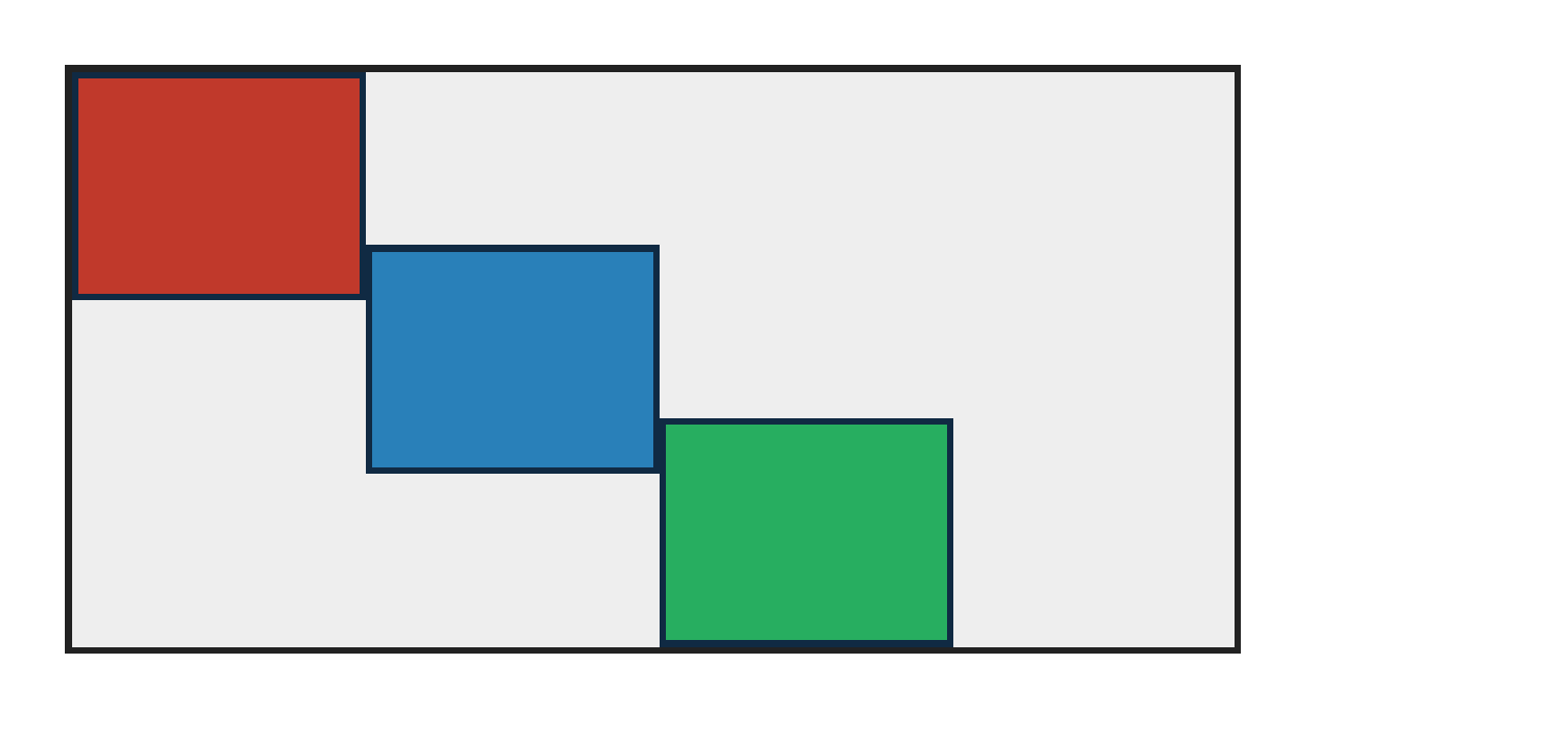
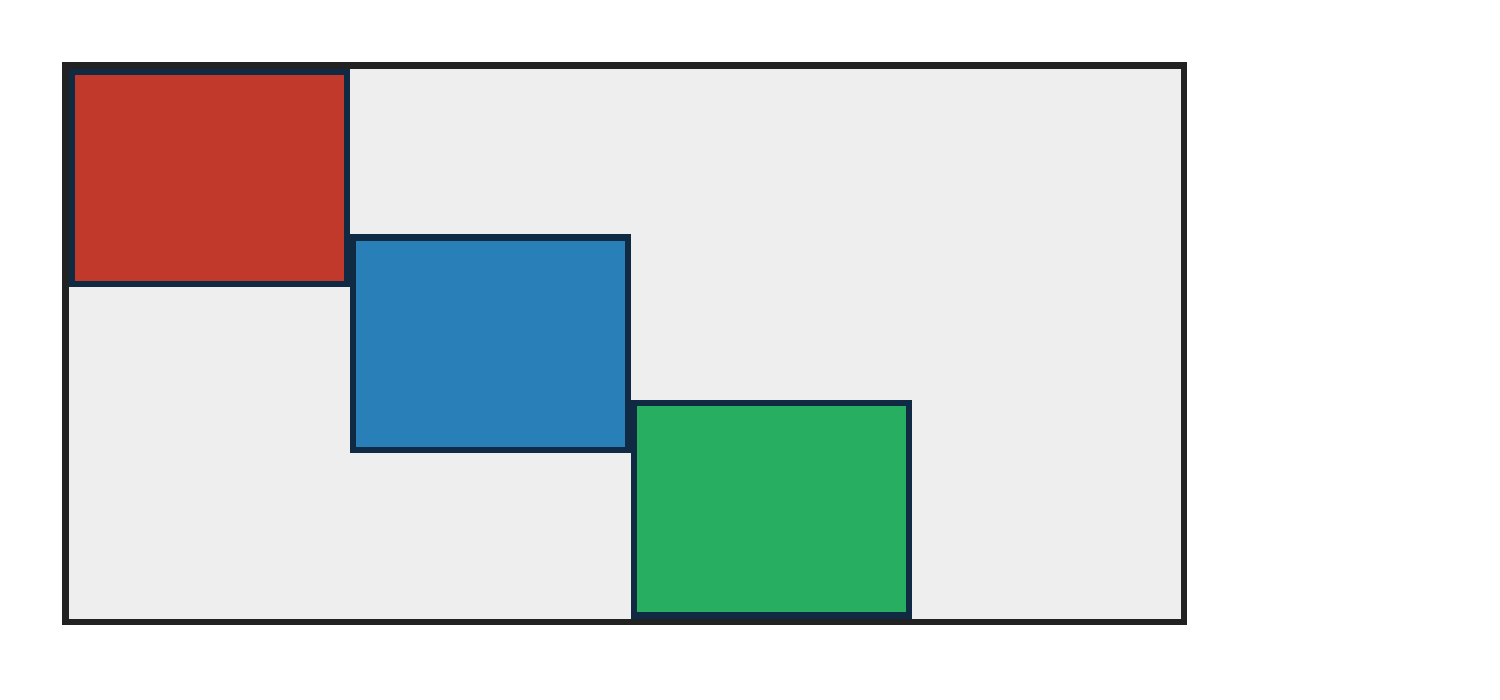
align-self overrides container align-items per item (flex-start container, one centered, one flex-end).
PASS exact match flexbox-align-self-flex-end · flex-end
Chrome ref
Chrome ref
ironpress
ironpress
full-page >1.0%/channel diff
align-self overrides container align-items per item: one box flex-end, one centered, one flex-start.
PASS exact match flexbox-align-self-safe-center · safe-center
Chrome ref
Chrome ref
ironpress
ironpress
full-page >1.0%/channel diff
align-self:safe center overrides container align-items:flex-start when the item fits; catches parsers that leave align-self:auto.

aspect-ratio — 100.00% verified visual parity PASS 2 · FAIL 0 · REFERENCE-DISPUTED 0all categories ↑

PASS exact match flexbox-aspect-ratio-grow-cross-size · cross-size-after-grow
Chrome ref
Chrome ref
ironpress
ironpress
full-page >1.0%/channel diff
Zero-basis growing flex items with aspect-ratio derive auto cross size from their final grown main size; catches implementations that compute aspect-ratio height before flex-grow.
PASS exact match flexbox-aspect-ratio-height-transfer · height-to-basis
Chrome ref
Chrome ref
ironpress
ironpress
full-page >1.0%/channel diff
A definite height plus aspect-ratio transfers into an auto main-size flex base in a row; catches code that only derives height from width.

auto-margins — 100.00% verified visual parity PASS 2 · FAIL 0 · REFERENCE-DISPUTED 0all categories ↑

PASS exact match flexbox-auto-margin-negative-free-space · negative-main-free-space
Chrome ref
Chrome ref
ironpress
ironpress
full-page >1.0%/channel diff
Main-axis auto margins are treated as zero when flex items overflow with negative free space; catches auto margins that still absorb space.
PASS exact match flexbox-cross-auto-margin-one-sided · one-sided-cross-axis
Chrome ref
Chrome ref
ironpress
ironpress
full-page >1.0%/channel diff
A one-sided cross-axis auto margin absorbs free space and pushes only that flex item to cross-end; catches implementations that only handle symmetric cross-axis auto margins.

automatic-minimum-size — 100.00% verified visual parity PASS 4 · FAIL 0 · REFERENCE-DISPUTED 0all categories ↑

PASS exact match flexbox-column-min-height-auto · column-min-height-auto
Chrome ref
Chrome ref
ironpress
ironpress
full-page >1.0%/channel diff
In flex-direction:column, min-height:auto gives a shrinkable item a content-based main-axis minimum; catches row-only auto-min logic that compresses content.
PASS exact match flexbox-min-width-zero-auto-min · min-width-zero
Chrome ref
Chrome ref
ironpress
ironpress
full-page >1.0%/channel diff
min-width:0 plus overflow:hidden disables the flex item's automatic min-content floor so equal flex items share the row; catches implementations that always reserve min-content width.
PASS exact match flexbox-overflow-hidden-auto-min · overflow-hidden
Chrome ref
Chrome ref
ironpress
ironpress
full-page >1.0%/channel diff
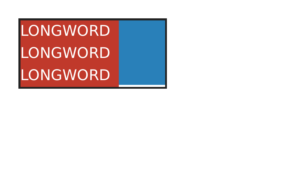
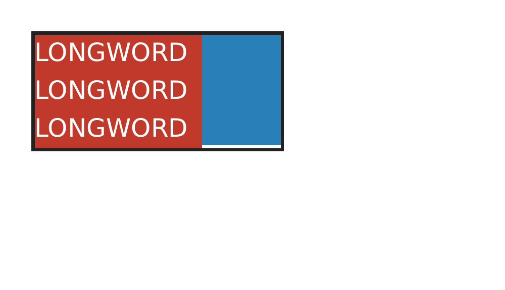
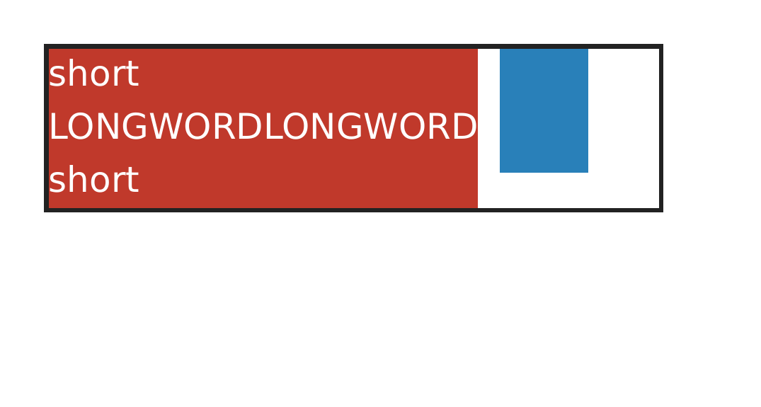
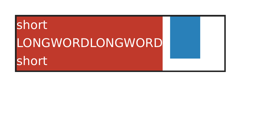
overflow:hidden alone makes a shrinking row flex item's automatic minimum size zero; catches implementations that always keep the min-content floor and push the following item out.
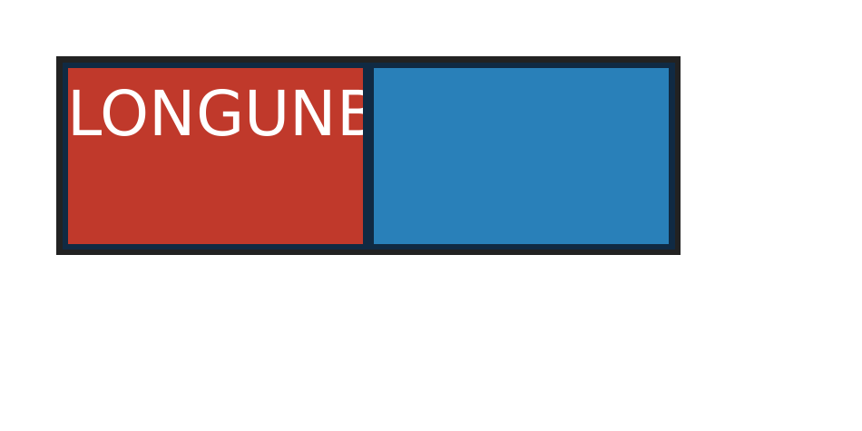
PASS exact match flexbox-overflow-wrap-anywhere-auto-min · overflow-wrap-anywhere
Chrome ref
Chrome ref
ironpress
ironpress
full-page >1.0%/channel diff
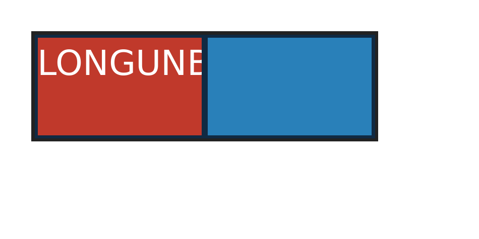
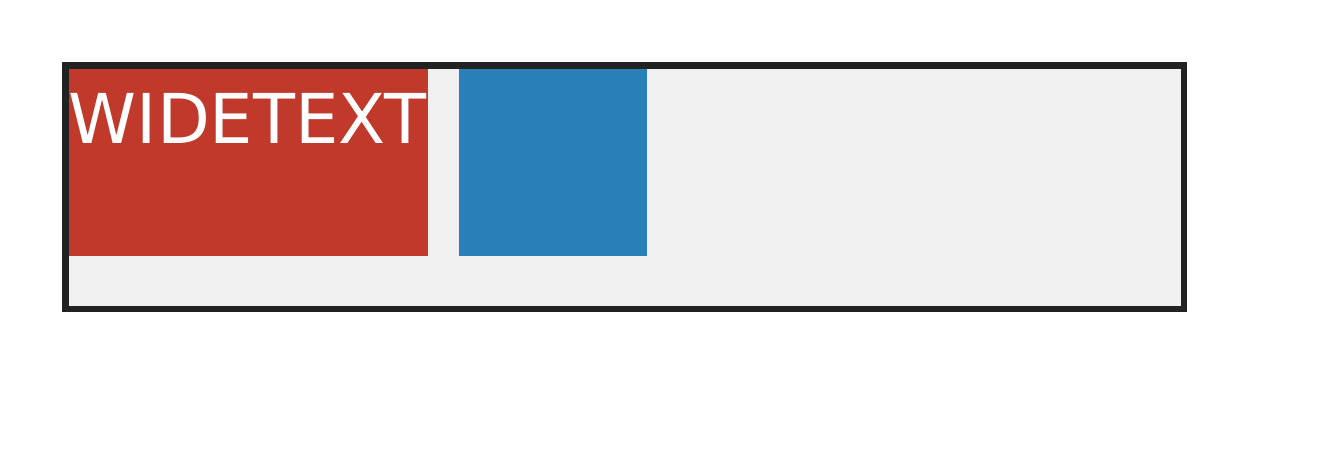
overflow-wrap:anywhere lowers a long-word flex item's automatic minimum size so the row can keep the following item inside; catches unbreakable min-content floors.

display — 100.00% verified visual parity PASS 5 · FAIL 0 · REFERENCE-DISPUTED 0all categories ↑

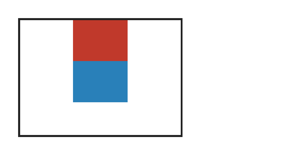
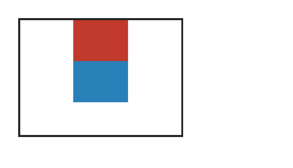
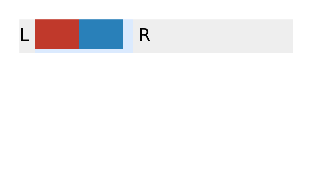
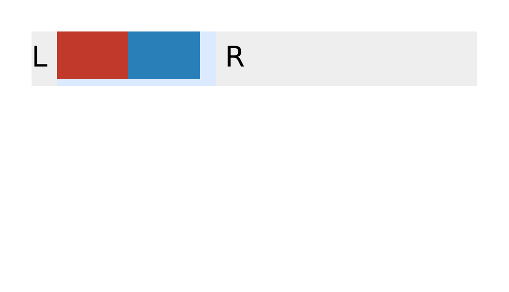
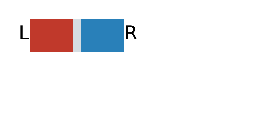
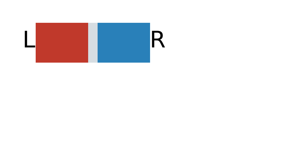
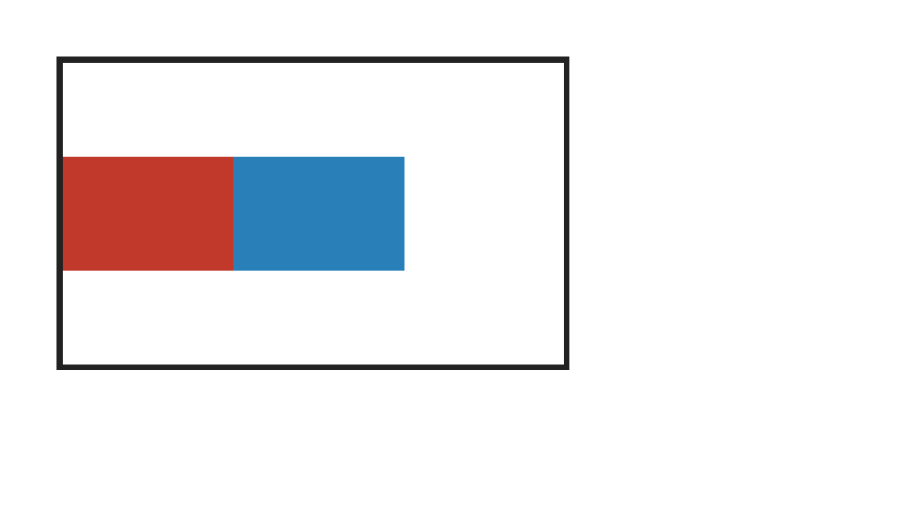
PASS visually equivalent · no rejecting defect · thresholded evidence 0.05% · raw 0.05% (295 px) flexbox-display-inline-flex-two-keyword · inline-flex-two-keywordPASS via CSS-scale observation: sub-CSS shared-colour coverageAntialiasCoverageΔE 9.2
Chrome ref
Chrome ref
ironpress
ironpress
full-page >1.0%/channel diff
why: visually accepted coverage phase; raw antialiasing coverage residue on a shared outline
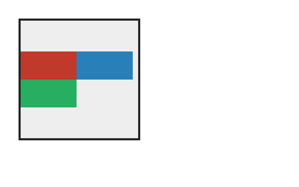
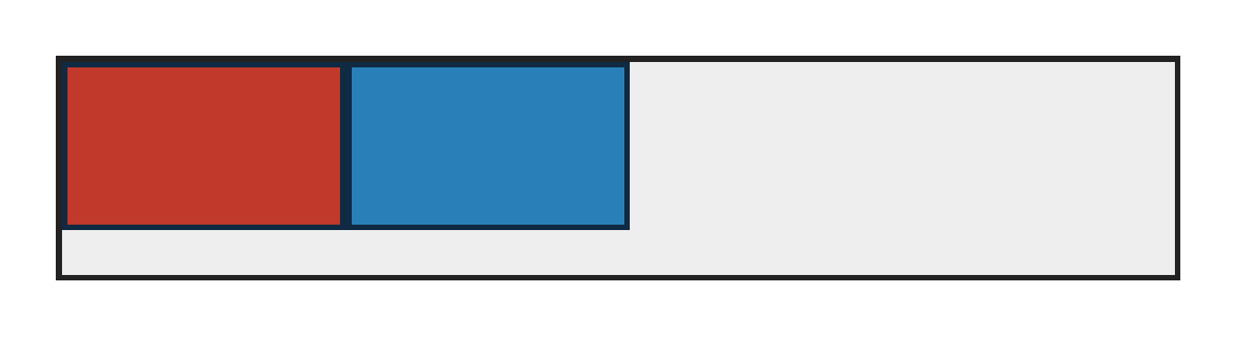
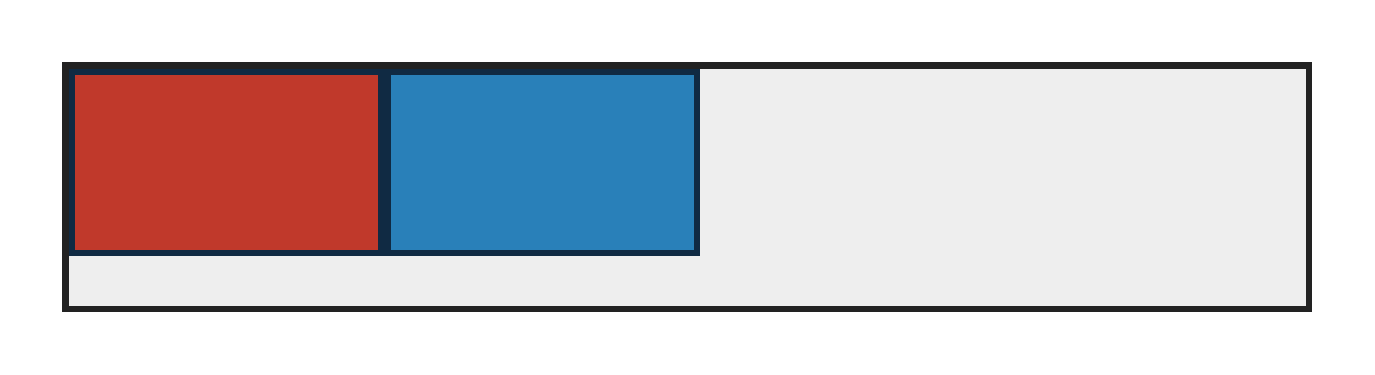
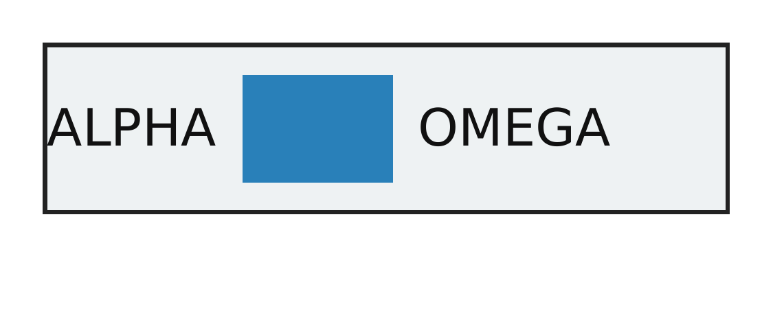
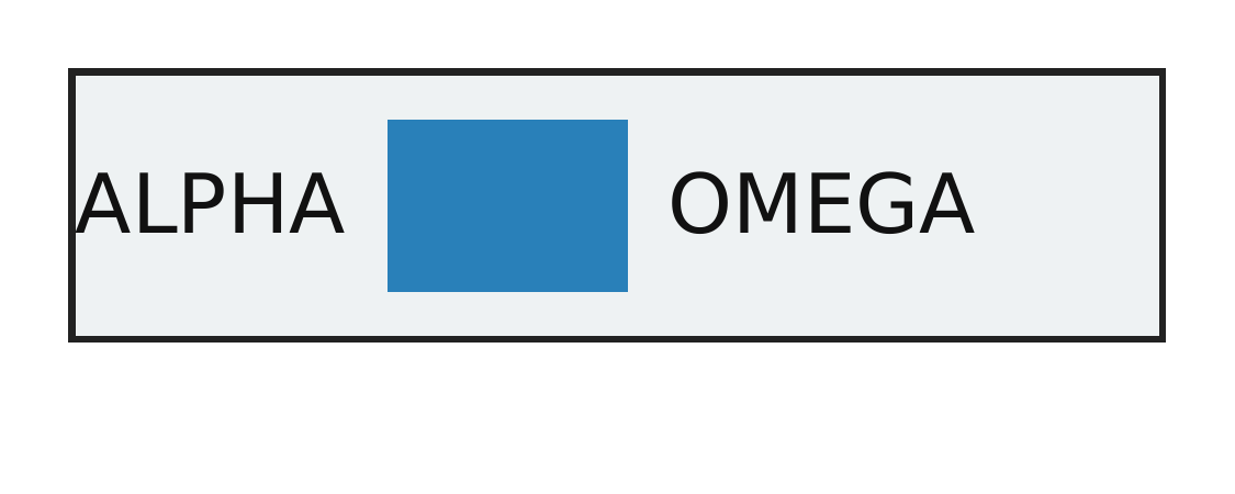
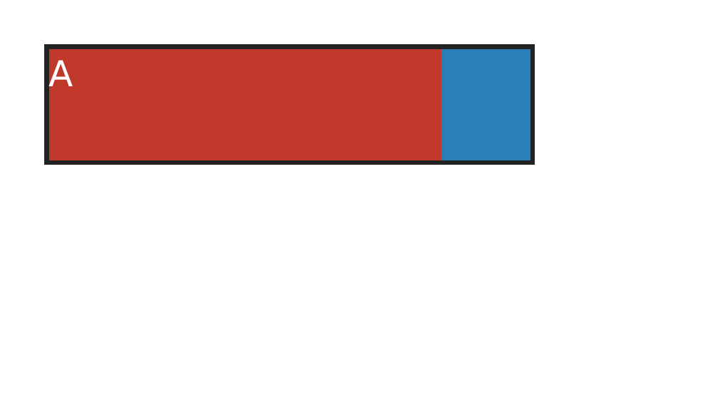
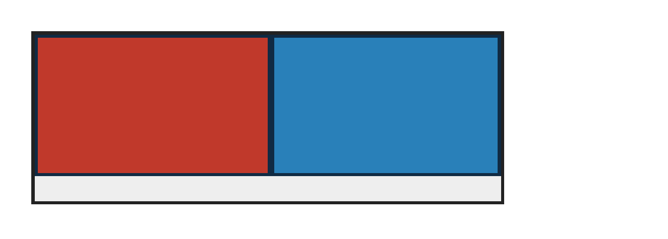
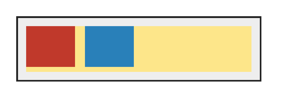
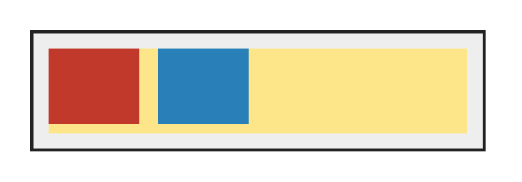
display:inline flex creates an inline-level flex container in a text line; catches parsers that ignore the two-keyword form and lose child sizing.
regions (3 total; showing 3 representatives)

Complete component census grouped by dominant raster class; representative details are bounded.

Complete dominant-class aggregates

classregionspixelsunion bbox (CSS px)largest pxmaximum magnitude
ColorErr329561,0 → 116,34107total 0.3% · largest 0.1% · max ΔE 9.2

Representative region details (worst-first)

classbbox (CSS px)area%magnitudereason
AntialiasCoverage116,0 → 116,340.1ΔE 9.2 ΔRGB(19,4,-16)antialiasing coverage residue on a shared outline
AntialiasCoverage61,0 → 61,300.1ΔRGB(-151,71,142)antialiasing coverage residue on a shared outline
AntialiasCoverage106,0 → 106,300.1ΔRGB(178,106,69)antialiasing coverage residue on a shared outline
source · cases/flexbox/flexbox-display-inline-flex-two-keyword.html
1<!doctype html>
2<html>
3<head>
4  <meta charset="utf-8">
5  <style>
6    @page { size: 320px 184px; margin: 0; }
7    html { font-family: ParitySans; line-height: 1.5; }
8    * { margin: 0; box-sizing: border-box; }
9    body { padding: 20px; font-size: 18px; }
10    .host { background: #eeeeee; }
11    .iflex { display: inline flex; width: 100px; height: 34px; vertical-align: middle; background: #dbeafe; }
12    .box { display: block; width: 45px; height: 30px; }
13    .a { background: #c0392b; }
14    .b { background: #2980b9; }
15  </style>
16</head>
17<body>
18  <p class="host">L <span class="iflex"><span class="box a"></span><span class="box b"></span></span> R</p>
19</body>
20</html>
PASS exact match flexbox-display-block-flex · block-flex
Chrome ref
Chrome ref
ironpress
ironpress
full-page >1.0%/channel diff
display:block flex uses modern two-keyword display syntax to create a block-level flex container; catches parsers that only recognize display:flex and stack children.
PASS exact match flexbox-display-contents-items · contents-flex-items
Chrome ref
Chrome ref
ironpress
ironpress
full-page >1.0%/channel diff
A display:contents child of a flex container is box-suppressed so its element children become flex items; catches wrappers that incorrectly become one flex item.
PASS exact match flexbox-display-flex · flex
Chrome ref
Chrome ref
ironpress
ironpress
full-page >1.0%/channel diff
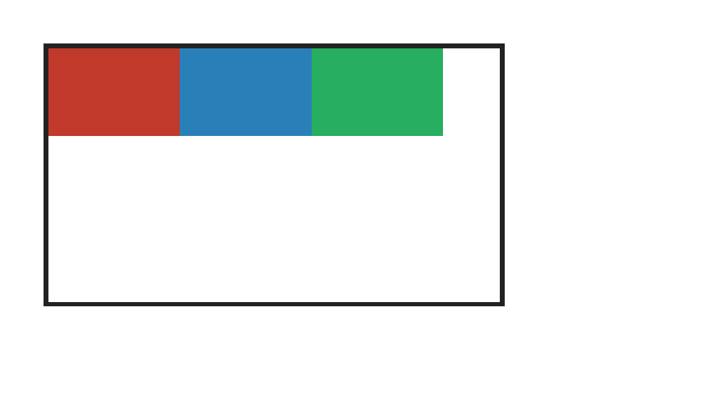
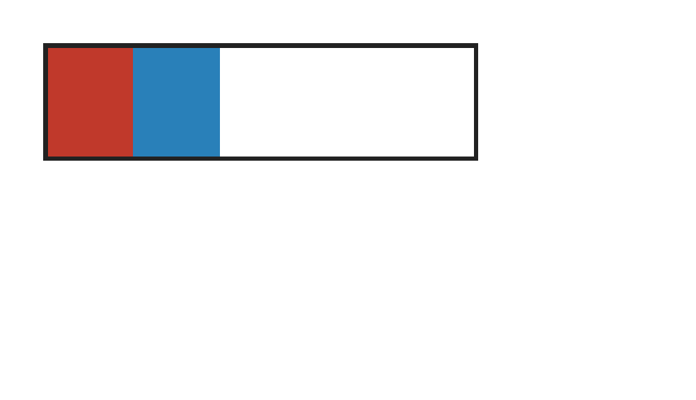
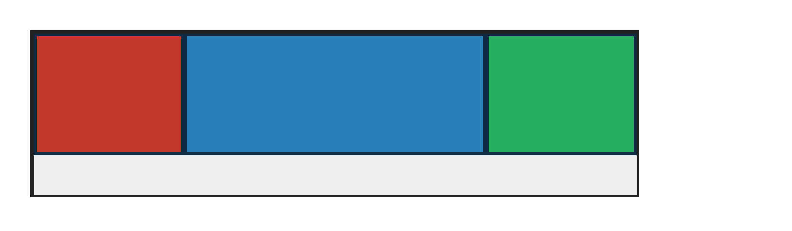
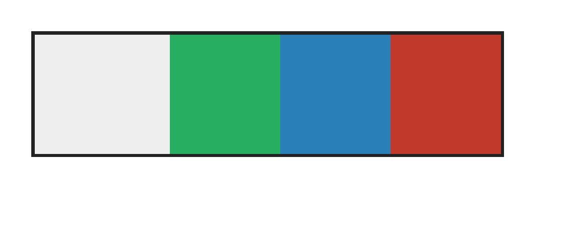
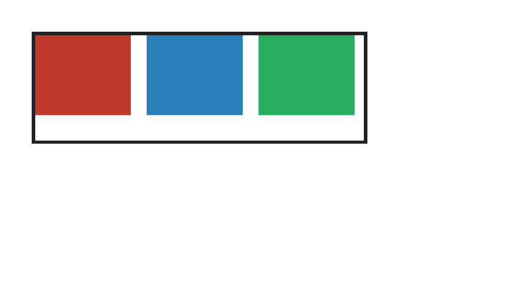
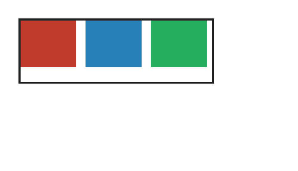
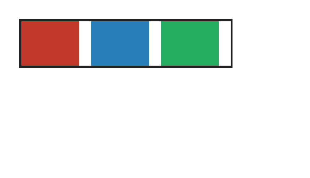
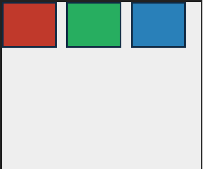
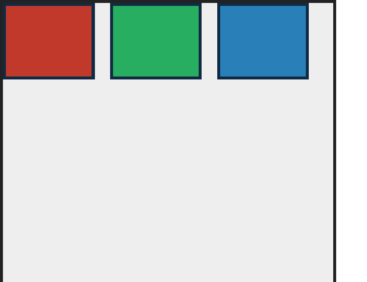
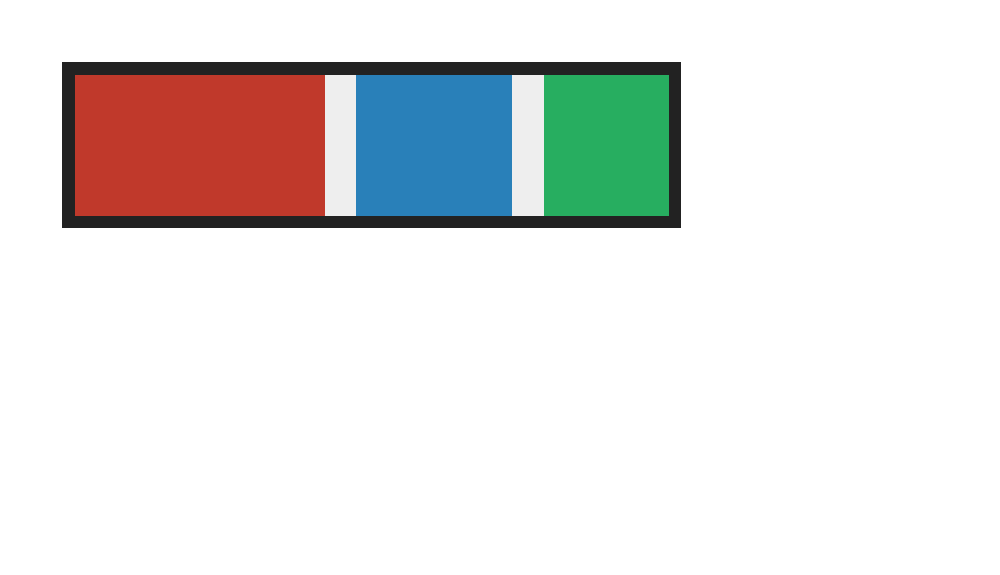
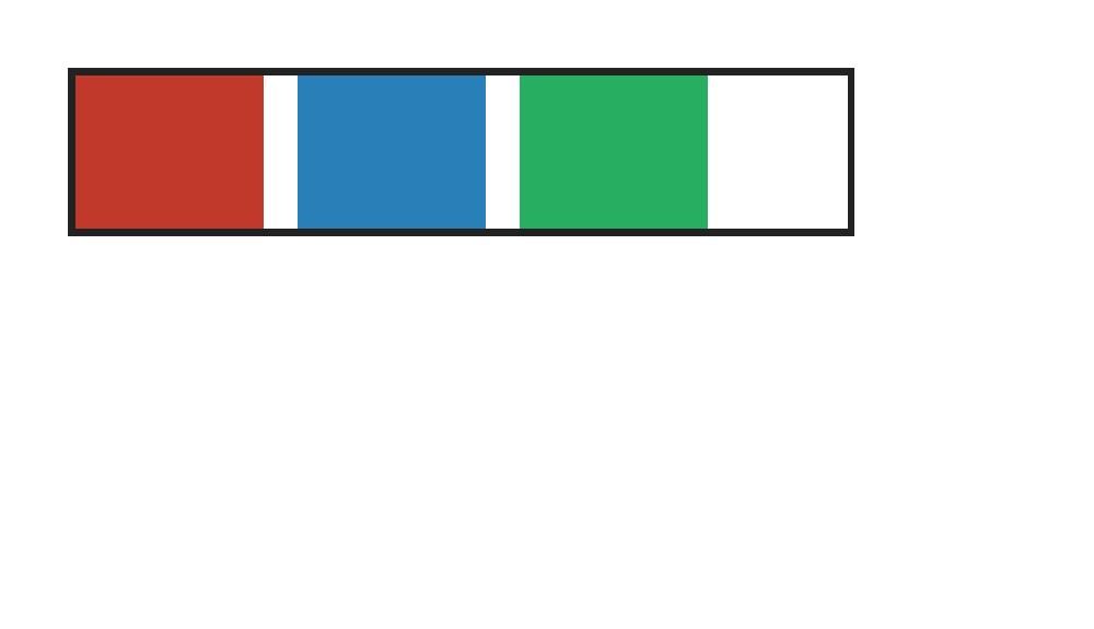
display:flex lays three fixed-size boxes in a row along the main axis with default packing.
PASS exact match flexbox-display-inline-flex · inline-flex
Chrome ref
Chrome ref
ironpress
ironpress
full-page >1.0%/channel diff
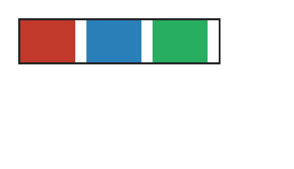
display:inline-flex creates an inline-level flex container that shares the line with surrounding text; catches parsers that only recognize block-level display:flex. The standards-derived Chrome reference corrects Chromium print-to-PDF's separate sub-CSS-pixel atomic-inline paint offset after its live DOM has laid out the same box correctly.

flex — 100.00% verified visual parity PASS 1 · FAIL 0 · REFERENCE-DISPUTED 0all categories ↑

PASS exact match flexbox-flex-shorthand-keywords · keywords
Chrome ref
Chrome ref
ironpress
ironpress
full-page >1.0%/channel diff
flex shorthand keywords none/auto/1 expand to 0 0 auto / 1 1 auto / 1 1 0 respectively.

flex-basis — 100.00% verified visual parity PASS 10 · FAIL 0 · REFERENCE-DISPUTED 0all categories ↑

PASS exact match flexbox-basis-content · content
Chrome ref
Chrome ref
ironpress
ironpress
full-page >1.0%/channel diff
flex-basis:content sizes the item to its content (text) instead of the explicit width:40px.
PASS exact match flexbox-column-percentage-flex-basis · percentage-column
Chrome ref
Chrome ref
ironpress
ironpress
full-page >1.0%/channel diff
Percentage flex-basis values in a definite-height column flex container resolve against the vertical main size; catches column code that treats percentages as auto.
PASS exact match flexbox-flex-basis · px
Chrome ref
Chrome ref
ironpress
ironpress
full-page >1.0%/channel diff
flex-basis sets explicit main-size for non-growing non-shrinking boxes (60/160/100px).
PASS exact match flexbox-flex-basis-auto · auto
Chrome ref
Chrome ref
ironpress
ironpress
full-page >1.0%/channel diff
flex-basis:auto resolves to each item's declared width with no grow/shrink.
PASS exact match flexbox-flex-basis-calc-percent · calc-percent
Chrome ref
Chrome ref
ironpress
ironpress
full-page >1.0%/channel diff
flex-basis:calc(25% - 10px) resolves against the definite row main size; catches implementations that ignore calc() and use auto or equal-share sizing.
PASS exact match flexbox-flex-basis-fit-content · fit-content
Chrome ref
Chrome ref
ironpress
ironpress
full-page >1.0%/channel diff
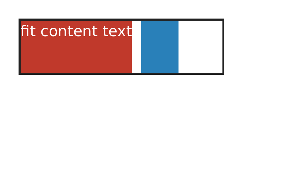
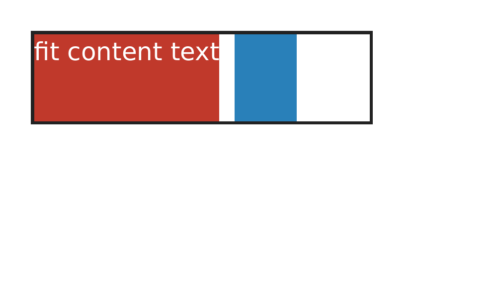
flex-basis:fit-content shrink-to-fit sizes the flex base rather than using a declared width fallback; catches parsers that ignore fit-content.
PASS exact match flexbox-flex-basis-max-content · max-content
Chrome ref
Chrome ref
ironpress
ironpress
full-page >1.0%/channel diff
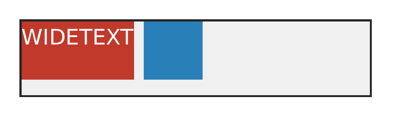
flex-basis:max-content must use the item's unwrapped max-content contribution instead of its small width; catches flex-basis parsers that reject intrinsic sizing keywords.
PASS exact match flexbox-flex-basis-min-content · min-content
Chrome ref
Chrome ref
ironpress
ironpress
full-page >1.0%/channel diff
flex-basis:min-content uses the min-content contribution as the flex base size; catches parsers that fall back to auto or max-content sizing.
PASS exact match flexbox-flex-basis-percentage · percentage
Chrome ref
Chrome ref
ironpress
ironpress
full-page >1.0%/channel diff
flex-basis percentages resolve against the container inner main size (25/50/25%).
PASS exact match flexbox-flex-basis-zero · zero
Chrome ref
Chrome ref
ironpress
ironpress
full-page >1.0%/channel diff
flex-basis:0 with equal grow makes every item the same size regardless of content.

flex-direction — 100.00% verified visual parity PASS 5 · FAIL 0 · REFERENCE-DISPUTED 0all categories ↑

PASS exact match flexbox-direction-rtl-row · row-rtl-main-start
Chrome ref
Chrome ref
ironpress
ironpress
full-page >1.0%/channel diff
flex-direction:row follows direction:rtl so source order starts at the right main-start edge; catches physical left-to-right row layout that ignores logical axis mapping.
PASS exact match flexbox-flex-direction-column · column
Chrome ref
Chrome ref
ironpress
ironpress
full-page >1.0%/channel diff
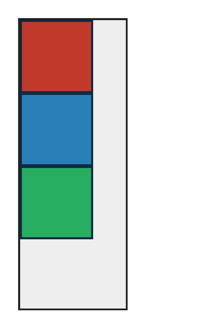
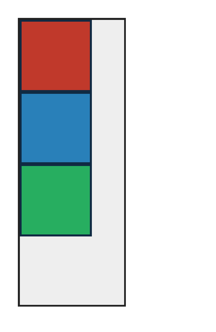
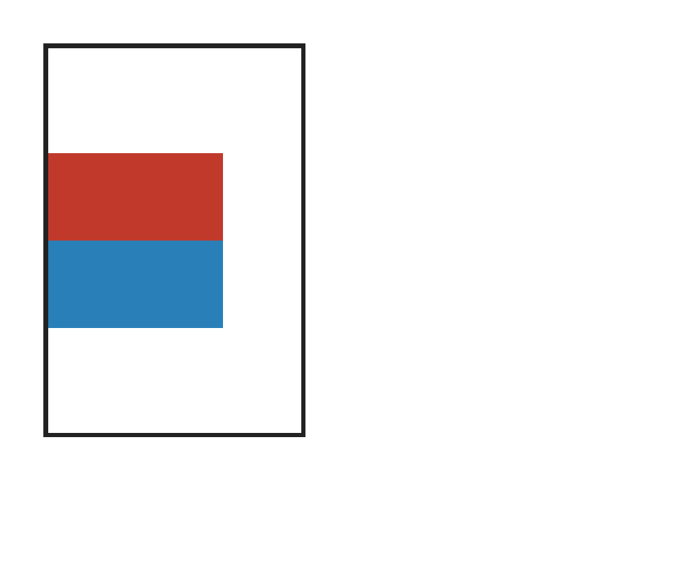
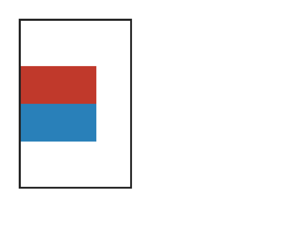
flex-direction:column stacks items top-to-bottom along the vertical main axis.
PASS exact match flexbox-flex-direction-column-reverse · column-reverse
Chrome ref
Chrome ref
ironpress
ironpress
full-page >1.0%/channel diff
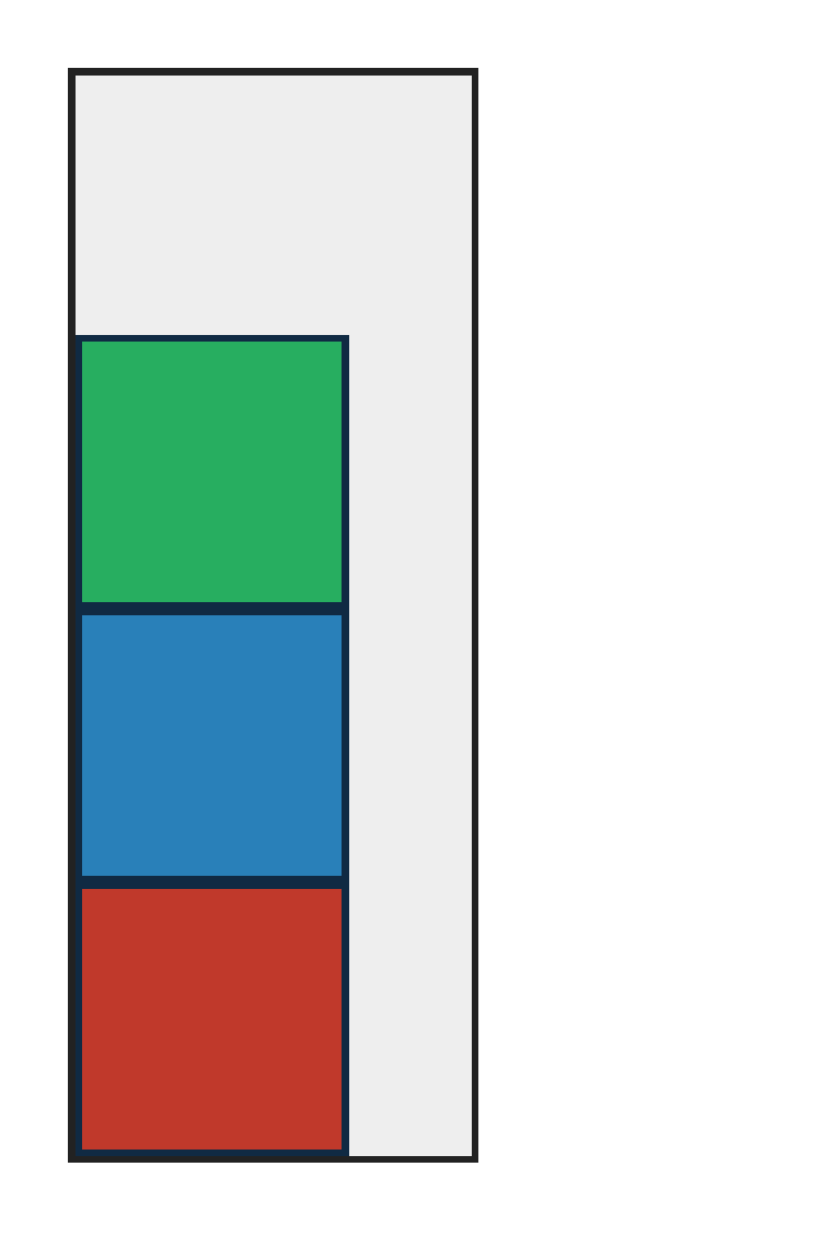
flex-direction:column-reverse stacks items bottom-to-top in reverse source order.
PASS exact match flexbox-flex-direction-row-reverse · row-reverse
Chrome ref
Chrome ref
ironpress
ironpress
full-page >1.0%/channel diff
flex-direction:row-reverse reverses the main axis so items pack from the right edge in reverse source order.
PASS exact match flexbox-row-reverse-rtl · row-reverse-rtl
Chrome ref
Chrome ref
ironpress
ironpress
full-page >1.0%/channel diff
direction:rtl plus flex-direction:row-reverse reverses the RTL inline axis so visual order runs left-to-right; catches physical row-reverse placement.

flex-flow — 100.00% verified visual parity PASS 1 · FAIL 0 · REFERENCE-DISPUTED 0all categories ↑

PASS exact match flexbox-flex-flow · row-wrap
Chrome ref
Chrome ref
ironpress
ironpress
full-page >1.0%/channel diff
flex-flow shorthand sets flex-direction and flex-wrap together (row wrap).

flex-grow — 100.00% verified visual parity PASS 5 · FAIL 0 · REFERENCE-DISPUTED 0all categories ↑

PASS exact match flexbox-column-flex-grow · column
Chrome ref
Chrome ref
ironpress
ironpress
full-page >1.0%/channel diff
In a definite-height column flex container, grow factors distribute vertical free space; catches row-only flex-grow implementations.
PASS exact match flexbox-flex-grow · ratio
Chrome ref
Chrome ref
ironpress
ironpress
full-page >1.0%/channel diff
flex-grow distributes free space in a 1:2:1 ratio over zero-basis boxes.
PASS exact match flexbox-flex-grow-basis-auto · basis-auto
Chrome ref
Chrome ref
ironpress
ironpress
full-page >1.0%/channel diff
flex-grow with flex-basis:auto adds free space on top of each item's content-sized base, keeping the larger base wider.
PASS exact match flexbox-grow-fractional · fractional-sum
Chrome ref
Chrome ref
ironpress
ironpress
full-page >1.0%/channel diff
When the flex-grow factors sum to less than 1, only that fraction of the positive free space is distributed, leaving the remainder unfilled (css-flexbox-1 §9.7 step 4.b).
PASS exact match flexbox-invalid-negative-flex-grow-preserves-prior-value · invalid-negative-declaration-discard
Chrome ref
Chrome ref
ironpress
ironpress
full-page >1.0%/channel diff
A negative flex-grow is invalid and must be discarded, leaving the earlier flex-grow:1 to absorb the available main-axis space.

flex-item — 100.00% verified visual parity PASS 3 · FAIL 0 · REFERENCE-DISPUTED 0all categories ↑

PASS exact match flexbox-float-clear-ignored · float-clear-ignored
Chrome ref
Chrome ref
ironpress
ironpress
full-page >1.0%/channel diff
float and clear on a flex item do not affect its source-order flex placement; catches layout that lets float or clear move the item.
PASS exact match flexbox-inline-item-blockification · blockification
Chrome ref
Chrome ref
ironpress
ironpress
full-page >1.0%/channel diff
Inline direct children are blockified as flex items and honor width and height; catches inline-formatting implementations that render tiny inline spans.
PASS exact match flexbox-vertical-align-ignored · vertical-align-ignored
Chrome ref
Chrome ref
ironpress
ironpress
full-page >1.0%/channel diff
vertical-align on a flex item is ignored and must not override align-items:flex-start; catches inline vertical-align being applied to flex items.

flex-item-children — 100.00% verified visual parity PASS 3 · FAIL 0 · REFERENCE-DISPUTED 0all categories ↑

PASS visually equivalent · no rejecting defect · thresholded evidence 0.02% · raw 0.02% (36 px) flexbox-item-inline-svg-child · inline-svg-childPASS via CSS-scale observation: sub-CSS shared-colour coverageAntialiasCoverageΔE 5.0
Chrome ref
Chrome ref
ironpress
ironpress
full-page >1.0%/channel diff
why: visually accepted coverage phase; raw antialiasing coverage residue on a shared outline
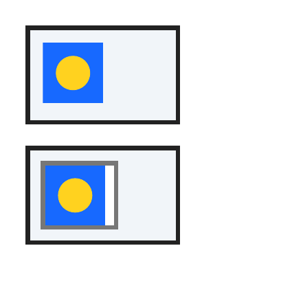
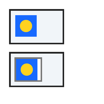
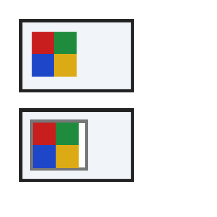
An inline SVG paints in normal flow and should also paint as a direct child of a simple flex item; catches the simple flex-item text collector dropping replaced/vector children.
regions (32 total; showing 32 representatives)

Complete component census grouped by dominant raster class; representative details are bounded.

Complete dominant-class aggregates

classregionspixelsunion bbox (CSS px)largest pxmaximum magnitude
ColorErr323614,14 → 31,872total 0.05% · largest 0.002786%

Representative region details (worst-first)

classbbox (CSS px)area%magnitudereason
AntialiasCoverage19,15 → 19,150.002786ΔRGB(20,9,-14)antialiasing coverage residue on a shared outline
AntialiasCoverage15,19 → 15,190.002786ΔRGB(20,9,-14)antialiasing coverage residue on a shared outline
AntialiasCoverage29,19 → 29,190.002786ΔRGB(14,6,-4)antialiasing coverage residue on a shared outline
AntialiasCoverage19,29 → 19,290.002786ΔRGB(14,6,-4)antialiasing coverage residue on a shared outline
AntialiasCoverage21,14 → 21,140.001393ΔRGB(-16,-7,16)antialiasing coverage residue on a shared outline
AntialiasCoverage23,14 → 23,140.001393ΔRGB(-20,-9,18)antialiasing coverage residue on a shared outline
AntialiasCoverage25,15 → 25,150.001393ΔRGB(37,17,-35)antialiasing coverage residue on a shared outline
AntialiasCoverage17,15 → 17,150.001393ΔRGB(9,4,-9)antialiasing coverage residue on a shared outline
AntialiasCoverage27,15 → 27,150.001393ΔRGB(14,7,-14)antialiasing coverage residue on a shared outline
AntialiasCoverage15,17 → 15,170.001393ΔRGB(9,4,-9)antialiasing coverage residue on a shared outline
AntialiasCoverage28,17 → 28,170.001393ΔRGB(16,7,-16)antialiasing coverage residue on a shared outline
AntialiasCoverage14,21 → 14,210.001393ΔRGB(-16,-7,16)antialiasing coverage residue on a shared outline
AntialiasCoverage30,21 → 30,210.001393ΔRGB(-7,-3,6)antialiasing coverage residue on a shared outline
AntialiasCoverage14,23 → 14,230.001393ΔRGB(-20,-9,18)antialiasing coverage residue on a shared outline
AntialiasCoverage30,23 → 30,230.001393ΔRGB(-10,-5,10)antialiasing coverage residue on a shared outline
AntialiasCoverage15,25 → 15,250.001393ΔRGB(37,17,-35)antialiasing coverage residue on a shared outline
AntialiasCoverage29,25 → 29,250.001393ΔRGB(19,9,-19)antialiasing coverage residue on a shared outline
AntialiasCoverage15,27 → 15,270.001393ΔRGB(14,7,-14)antialiasing coverage residue on a shared outline
AntialiasCoverage28,27 → 28,270.001393ΔRGB(20,9,-19)antialiasing coverage residue on a shared outline
AntialiasCoverage17,28 → 17,280.001393ΔRGB(16,7,-16)antialiasing coverage residue on a shared outline
AntialiasCoverage27,28 → 27,280.001393ΔRGB(20,9,-19)antialiasing coverage residue on a shared outline
AntialiasCoverage25,29 → 25,290.001393ΔRGB(19,9,-19)antialiasing coverage residue on a shared outline
AntialiasCoverage21,30 → 21,300.001393ΔRGB(-7,-3,6)antialiasing coverage residue on a shared outline
AntialiasCoverage23,30 → 23,300.001393ΔRGB(-10,-5,10)antialiasing coverage residue on a shared outline
AntialiasCoverage21,71 → 21,710.001393ΔRGB(3,1,-4)antialiasing coverage residue on a shared outline
AntialiasCoverage25,71 → 25,710.001393ΔRGB(10,5,-10)antialiasing coverage residue on a shared outline
AntialiasCoverage15,77 → 15,770.001393ΔRGB(3,1,-4)antialiasing coverage residue on a shared outline
AntialiasCoverage31,77 → 31,770.001393ΔRGB(19,9,-19)antialiasing coverage residue on a shared outline
AntialiasCoverage15,81 → 15,810.001393ΔRGB(10,5,-10)antialiasing coverage residue on a shared outline
AntialiasCoverage31,81 → 31,810.001393ΔRGB(22,10,-21)antialiasing coverage residue on a shared outline
AntialiasCoverage21,87 → 21,870.001393ΔRGB(19,9,-19)antialiasing coverage residue on a shared outline
AntialiasCoverage25,87 → 25,870.001393ΔRGB(22,10,-21)antialiasing coverage residue on a shared outline
source · cases/flexbox/flexbox-item-inline-svg-child.html
1<!doctype html>
2<html>
3<head>
4<meta charset="utf-8">
5<style>
6@page{size:136px 136px;margin:0}
7html{font-family:ParitySans;line-height:1.5}
8*{margin:0;box-sizing:border-box}
9html,body{background:#fff}
10body{padding:12px}
11.control{width:72px;height:46px;border:2px solid #222;background:#f1f5f9;padding:6px;margin-bottom:10px}
12.flex{display:flex;width:72px;height:46px;border:2px solid #222;background:#f1f5f9;padding:5px;align-items:flex-start}
13.item{width:36px;height:32px;border:2px solid #777;background:#fff}
14svg{display:block;width:28px;height:28px}
15</style>
16</head>
17<body>
18<div class="control"><svg viewBox="0 0 28 28"><rect width="28" height="28" fill="#1769ff"/><circle cx="14" cy="14" r="8" fill="#ffd21f"/></svg></div>
19<div class="flex"><div class="item"><svg viewBox="0 0 28 28"><rect width="28" height="28" fill="#1769ff"/><circle cx="14" cy="14" r="8" fill="#ffd21f"/></svg></div></div>
20</body>
21</html>
PASS visually equivalent · no rejecting defect · thresholded evidence 0.008533% · raw 0.008533% (16 px) flexbox-item-img-sizing-child · img-sizing-childPASS via CSS-scale observation: sub-CSS shared-colour coverageAntialiasCoverageΔE 3.3
Chrome ref
Chrome ref
ironpress
ironpress
full-page >1.0%/channel diff
why: visually accepted coverage phase; raw antialiasing coverage residue on a shared outline
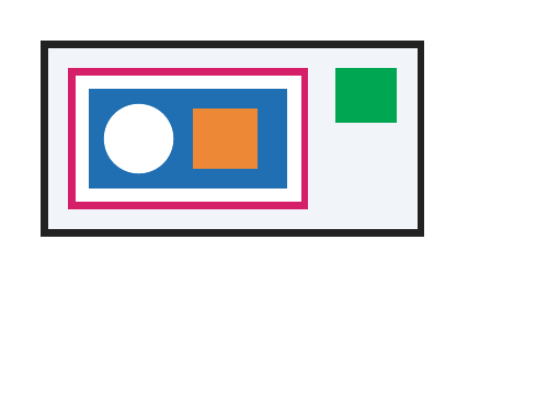
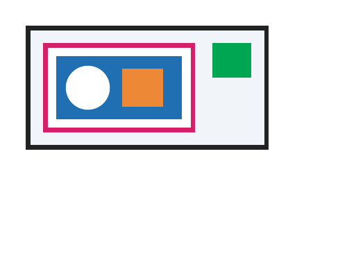
A flex item containing an img with explicit width and height:auto must keep intrinsic aspect-ratio sizing and paint the replaced child.
regions (16 total; showing 16 representatives)

Complete component census grouped by dominant raster class; representative details are bounded.

Complete dominant-class aggregates

classregionspixelsunion bbox (CSS px)largest pxmaximum magnitude
ColorErr161619,19 → 38,381total 0.03% · largest 0.001596%

Representative region details (worst-first)

classbbox (CSS px)area%magnitudereason
AntialiasCoverage31,19 → 31,190.001596ΔRGB(15,10,5)antialiasing coverage residue on a shared outline
AntialiasCoverage33,19 → 33,190.001596ΔRGB(15,10,5)antialiasing coverage residue on a shared outline
AntialiasCoverage23,20 → 23,200.001596ΔRGB(19,12,6)antialiasing coverage residue on a shared outline
AntialiasCoverage22,20 → 22,200.001596ΔRGB(-10,-7,-3)antialiasing coverage residue on a shared outline
AntialiasCoverage20,22 → 20,220.001596ΔRGB(-10,-7,-3)antialiasing coverage residue on a shared outline
AntialiasCoverage20,23 → 20,230.001596ΔRGB(19,12,6)antialiasing coverage residue on a shared outline
AntialiasCoverage19,31 → 19,310.001596ΔRGB(15,10,5)antialiasing coverage residue on a shared outline
AntialiasCoverage38,32 → 38,320.001596ΔRGB(19,13,7)antialiasing coverage residue on a shared outline
AntialiasCoverage19,33 → 19,330.001596ΔRGB(15,10,5)antialiasing coverage residue on a shared outline
AntialiasCoverage38,33 → 38,330.001596ΔRGB(17,10,5)antialiasing coverage residue on a shared outline
AntialiasCoverage37,34 → 37,340.001596ΔRGB(9,5,3)antialiasing coverage residue on a shared outline
AntialiasCoverage37,34 → 37,340.001596ΔRGB(15,10,5)antialiasing coverage residue on a shared outline
AntialiasCoverage34,37 → 34,370.001596ΔRGB(15,10,5)antialiasing coverage residue on a shared outline
AntialiasCoverage34,37 → 34,370.001596ΔRGB(9,5,3)antialiasing coverage residue on a shared outline
AntialiasCoverage33,38 → 33,380.001596ΔRGB(17,10,5)antialiasing coverage residue on a shared outline
AntialiasCoverage32,38 → 32,380.001596ΔRGB(19,13,7)antialiasing coverage residue on a shared outline
source · cases/flexbox/flexbox-item-img-sizing-child.html
1<!doctype html>
2<html>
3<head>
4<meta charset="utf-8">
5<style>
6@page{size:160px 120px;margin:0}
7html{font-family:ParitySans;line-height:1.5}
8*{margin:0;box-sizing:border-box}
9html,body{background:#fff}
10body{padding:12px}
11.flex{display:flex;align-items:flex-start;width:112px;border:2px solid #222;background:#f1f5f9;padding:6px;gap:8px}
12.item{width:70px;border:2px solid #d61f69;background:#fff;padding:4px}
13img{display:block;width:58px;height:auto}
14.side{width:18px;height:16px;background:#00a651}
15</style>
16</head>
17<body>
18<div class="flex"><div class="item"><img alt="" src="data:image/svg+xml,%3Csvg xmlns='http://www.w3.org/2000/svg' width='80' height='40' viewBox='0 0 80 40'%3E%3Crect width='80' height='40' fill='%231f6fb2'/%3E%3Ccircle cx='20' cy='20' r='14' fill='%23fff'/%3E%3Crect x='42' y='8' width='26' height='24' fill='%23ed8936'/%3E%3C/svg%3E"></div><div class="side"></div></div>
19</body>
20</html>
PASS exact match flexbox-item-raster-img-child · raster-img-child
Chrome ref
Chrome ref
ironpress
ironpress
full-page >1.0%/channel diff
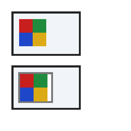
A raster img paints in normal flow and should also paint as a direct child of a simple flex item; catches the simple flex-item text collector dropping replaced children.

flex-item-positioning — 100.00% verified visual parity PASS 2 · FAIL 0 · REFERENCE-DISPUTED 0all categories ↑

PASS exact match flexbox-item-margin · item-margin
Chrome ref
Chrome ref
ironpress
ironpress
full-page >1.0%/channel diff
Flex item margin: honored during placement/paint.
PASS exact match flexbox-item-relative-offset · item-relative-offset
Chrome ref
Chrome ref
ironpress
ironpress
full-page >1.0%/channel diff
Flex item relative-offset: honored during placement/paint.

flex-items — 100.00% verified visual parity PASS 1 · FAIL 0 · REFERENCE-DISPUTED 0all categories ↑

PASS exact match flexbox-anonymous-text-items · anonymous-text
Chrome ref
Chrome ref
ironpress
ironpress
full-page >1.0%/channel diff
Direct text around an element child becomes anonymous flex items and remains visible in the flex row; catches implementations that iterate only element children and drop text nodes.

flex-shorthand — 100.00% verified visual parity PASS 2 · FAIL 0 · REFERENCE-DISPUTED 0all categories ↑

PASS exact match flexbox-flex-shorthand-basis-only · basis-only
Chrome ref
Chrome ref
ironpress
ironpress
full-page >1.0%/channel diff
The one-token flex:80px shorthand is a flex-basis form with grow and shrink enabled; catches parsers that only accept numeric grow values.
PASS exact match flexbox-flex-shorthand-grow-basis · grow-basis
Chrome ref
Chrome ref
ironpress
ironpress
full-page >1.0%/channel diff
The two-token flex:1 80px shorthand means grow factor plus basis, not grow plus shrink; catches parsers that give both items zero basis.

flex-shrink — 100.00% verified visual parity PASS 4 · FAIL 0 · REFERENCE-DISPUTED 0all categories ↑

PASS exact match flexbox-column-flex-shrink · column
Chrome ref
Chrome ref
ironpress
ironpress
full-page >1.0%/channel diff
In a definite-height column flex container, negative free space is removed using scaled shrink factors on the vertical main axis; catches row-only or unscaled shrink.
PASS exact match flexbox-flex-shrink · ratio
Chrome ref
Chrome ref
ironpress
ironpress
full-page >1.0%/channel diff
flex-shrink removes overflow in a 1:2 ratio when two oversized boxes exceed the container width.
PASS exact match flexbox-flex-shrink-zero · zero
Chrome ref
Chrome ref
ironpress
ironpress
full-page >1.0%/channel diff
flex-shrink:0 makes one item refuse to shrink, forcing the others to absorb the overflow.
PASS exact match flexbox-shrink-fractional · fractional-sum
Chrome ref
Chrome ref
ironpress
ironpress
full-page >1.0%/channel diff
When the flex-shrink factors sum to less than 1, only that fraction of the negative free space is absorbed, so the items overflow the container (css-flexbox-1 §9.7 step 4.b).

flex-wrap — 100.00% verified visual parity PASS 4 · FAIL 0 · REFERENCE-DISPUTED 0all categories ↑

PASS exact match flexbox-column-wrap · column-wrap
Chrome ref
Chrome ref
ironpress
ironpress
full-page >1.0%/channel diff
flex-direction:column with flex-wrap:wrap starts additional columns when items exceed the container height.
PASS exact match flexbox-flex-wrap · wrap
Chrome ref
Chrome ref
ironpress
ironpress
full-page >1.0%/channel diff
flex-wrap:wrap breaks four boxes onto two lines when they overflow the container width.
PASS exact match flexbox-flex-wrap-nowrap · nowrap
Chrome ref
Chrome ref
ironpress
ironpress
full-page >1.0%/channel diff
flex-wrap:nowrap keeps a single line; shrinkable items compress to fit the container.
PASS exact match flexbox-flex-wrap-wrap-reverse · wrap-reverse
Chrome ref
Chrome ref
ironpress
ironpress
full-page >1.0%/channel diff
flex-wrap:wrap-reverse stacks wrapped lines from cross-end toward cross-start (second line above first).

fragmentation — 100.00% verified visual parity PASS 3 · FAIL 0 · REFERENCE-DISPUTED 0all categories ↑

PASS exact match flexbox-break-after-item · break-after-item · 2 pages
page 1
Chrome ref
Chrome ref
ironpress
ironpress
full-page >1.0%/channel diff
page 2
Chrome ref
Chrome ref
ironpress
ironpress
full-page >1.0%/channel diff
break-after:page on a column flex item creates a forced page break after that item; catches flex layout that ignores child break-after.
PASS exact match flexbox-break-before-item · break-before-item · 2 pages
page 1
Chrome ref
Chrome ref
ironpress
ironpress
full-page >1.0%/channel diff
page 2
Chrome ref
Chrome ref
ironpress
ironpress
full-page >1.0%/channel diff
break-before:page on a column flex item creates a forced page break before that item; catches flex layout that ignores child break-before.
PASS exact match flexbox-fragmentation-wrap-pages · wrapped-lines-across-pages · 2 pages
page 1
Chrome ref
Chrome ref
ironpress
ironpress
full-page >1.0%/channel diff
page 2
Chrome ref
Chrome ref
ironpress
ironpress
full-page >1.0%/channel diff
break-before:page on a wrapped row flex item propagates to its flex line, forcing a page break between lines rather than inside a sibling item.

gap — 100.00% verified visual parity PASS 8 · FAIL 0 · REFERENCE-DISPUTED 0all categories ↑

PASS exact match flexbox-column-row-gap-main-axis · column-row-gap-axis
Chrome ref
Chrome ref
ironpress
ironpress
full-page >1.0%/channel diff
row-gap, not column-gap, separates adjacent items along the vertical main axis in flex-direction:column; catches physical column-gap-as-main-gap mapping.
PASS exact match flexbox-gap · fixed
Chrome ref
Chrome ref
ironpress
ironpress
full-page >1.0%/channel diff
gap:24px inserts a fixed 24px gap between adjacent flex items on the main axis.
PASS exact match flexbox-gap-calc · calc
Chrome ref
Chrome ref
ironpress
ironpress
full-page >1.0%/channel diff
gap:calc(10px + 10px) computes before flex item placement; catches gap code that ignores calc() values and packs boxes together.
PASS exact match flexbox-gap-percentage · percentage
Chrome ref
Chrome ref
ironpress
ironpress
full-page >1.0%/channel diff
A percentage gap resolves against the flex container's own content-box width (CSS Box Alignment §8.3), not the parent/ICB width.
PASS exact match flexbox-gap-two-value · two-value
Chrome ref
Chrome ref
ironpress
ironpress
full-page >1.0%/channel diff
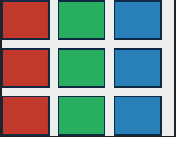
gap:<row> <column> applies the row value between wrapped lines and the column value between items in a line.
PASS exact match flexbox-grid-gap-alias · grid-gap-alias
Chrome ref
Chrome ref
ironpress
ironpress
full-page >1.0%/channel diff
legacy grid-gap aliases row-gap and column-gap and creates gaps in flex layout; catches engines that only apply grid-gap to CSS Grid.
PASS exact match flexbox-row-column-gap · longhands
Chrome ref
Chrome ref
ironpress
ironpress
full-page >1.0%/channel diff
row-gap and column-gap longhands set the two axes independently.
PASS exact match flexbox-row-gap-percentage-height · percentage-row-gap
Chrome ref
Chrome ref
ironpress
ironpress
full-page >1.0%/channel diff
A percentage row-gap in a definite-height wrapped row flex container resolves against the container content-box height; catches width-based or zero percentage gap resolution.

intrinsic-sizing — 100.00% verified visual parity PASS 2 · FAIL 0 · REFERENCE-DISPUTED 0all categories ↑

PASS exact match flexbox-container-width-max-content · max-content-width
Chrome ref
Chrome ref
ironpress
ironpress
full-page >1.0%/channel diff
width:max-content shrink-wraps a flex container to its flex line rather than filling the containing block; catches block-width-only flex container sizing.
PASS exact match flexbox-container-width-min-content · min-content-width
Chrome ref
Chrome ref
ironpress
ironpress
full-page >1.0%/channel diff
width:min-content gives a flex container an intrinsic width rather than a page-wide block width; catches flex layouts that ignore intrinsic width keywords.

justify-content — 100.00% verified visual parity PASS 11 · FAIL 0 · REFERENCE-DISPUTED 0all categories ↑

PASS exact match flexbox-column-justify-center · column-center
Chrome ref
Chrome ref
ironpress
ironpress
full-page >1.0%/channel diff
justify-content:center in flex-direction:column centers the item group on the vertical main axis; catches horizontal-only justify-content.
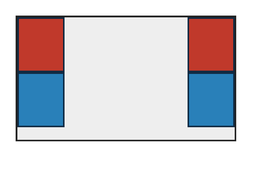
PASS exact match flexbox-invalid-justify-content-preserves-prior-value · invalid-declaration-discard
Chrome ref
Chrome ref
ironpress
ironpress
full-page >1.0%/channel diff
A later invalid justify-content declaration is discarded, so the earlier flex-end value continues to align the item at the inline end.
PASS exact match flexbox-justify-center-overflow · center-overflow
Chrome ref
Chrome ref
ironpress
ironpress
full-page >1.0%/channel diff
With negative free space (flex-shrink:0 items wider than the container) justify-content:center keeps items centered, overflowing equally past both main-axis edges instead of collapsing to flex-start (css-align-3 §9 Overflow Alignment).
PASS exact match flexbox-justify-content-center · center
Chrome ref
Chrome ref
ironpress
ironpress
full-page >1.0%/channel diff
justify-content:center groups items centered on the main axis with equal leftover space on both sides.
PASS exact match flexbox-justify-content-flex-end · flex-end
Chrome ref
Chrome ref
ironpress
ironpress
full-page >1.0%/channel diff
justify-content:flex-end packs items to the main-end edge.
PASS exact match flexbox-justify-content-flex-start · flex-start
Chrome ref
Chrome ref
ironpress
ironpress
full-page >1.0%/channel diff
justify-content:flex-start packs items to the main-start edge (explicit default packing).
PASS exact match flexbox-justify-content-space-around · space-around
Chrome ref
Chrome ref
ironpress
ironpress
full-page >1.0%/channel diff
justify-content:space-around distributes items with equal space around each, so edge gaps are half the inner gaps.
PASS exact match flexbox-justify-content-space-between · space-between
Chrome ref
Chrome ref
ironpress
ironpress
full-page >1.0%/channel diff
justify-content:space-between pins first and last boxes to the edges with equal gaps between.
PASS exact match flexbox-justify-content-space-evenly · space-evenly
Chrome ref
Chrome ref
ironpress
ironpress
full-page >1.0%/channel diff
justify-content:space-evenly distributes equal space between items and at both edges.
PASS exact match flexbox-justify-safe-center · safe-center
Chrome ref
Chrome ref
ironpress
ironpress
full-page >1.0%/channel diff
The css-align-3 safe/unsafe overflow-alignment prefix is parsed: when content fits, justify-content:safe center is identical to center.
PASS exact match flexbox-justify-safe-center-overflow · safe-center-overflow
Chrome ref
Chrome ref
ironpress
ironpress
full-page >1.0%/channel diff
justify-content:safe center falls back to start alignment when non-shrinking items overflow; catches implementations that strip safe and always perform unsafe centering.

margin — 100.00% verified visual parity PASS 3 · FAIL 0 · REFERENCE-DISPUTED 0all categories ↑

PASS exact match flexbox-margin-auto-center · auto-center
Chrome ref
Chrome ref
ironpress
ironpress
full-page >1.0%/channel diff
An item with margin:auto centers on both axes: the main-axis auto margins split the free space to center it horizontally and the cross-axis auto margins center it vertically, suppressing the default stretch (css-flexbox-1 §8.1).
PASS exact match flexbox-margin-auto-main-end · auto-main-end
Chrome ref
Chrome ref
ironpress
ironpress
full-page >1.0%/channel diff
An item with margin-left:auto absorbs the positive main free space and is pushed to the main-end edge, overriding the default flex-start packing (css-flexbox-1 §8.1).
PASS exact match flexbox-margin-auto-split · auto-split
Chrome ref
Chrome ref
ironpress
ironpress
full-page >1.0%/channel diff
With two items, margin-left:auto on the second pins the first to the main-start and pushes the second to the main-end, splitting the line (nav-bar idiom, css-flexbox-1 §8.1).

max-width — 100.00% verified visual parity PASS 1 · FAIL 0 · REFERENCE-DISPUTED 0all categories ↑

PASS exact match flexbox-max-width-clamp · clamp
Chrome ref
Chrome ref
ironpress
ironpress
full-page >1.0%/channel diff
max-width caps a growing flex item and redistributes the leftover free space to the other item.

min-height — 100.00% verified visual parity PASS 1 · FAIL 0 · REFERENCE-DISPUTED 0all categories ↑

PASS exact match flexbox-min-height-column · column-floor
Chrome ref
Chrome ref
ironpress
ironpress
full-page >1.0%/channel diff
min-height floors how far a column-direction item may shrink on the main (vertical) axis.

min-width — 100.00% verified visual parity PASS 2 · FAIL 0 · REFERENCE-DISPUTED 0all categories ↑

PASS exact match flexbox-min-content-no-overflow · auto-content-min
Chrome ref
Chrome ref
ironpress
ironpress
full-page >1.0%/channel diff
Flex items with min-width:auto floor at their content-based minimum size: two shrinking text items stop at min-content and sit side by side without overlapping (css-flexbox-1 §4.5).
PASS exact match flexbox-min-width-constraint · shrink-floor
Chrome ref
Chrome ref
ironpress
ironpress
full-page >1.0%/channel diff
min-width floors how far a flex item may shrink, forcing the other item to absorb the rest of the overflow.

nested-flex — 100.00% verified visual parity PASS 4 · FAIL 0 · REFERENCE-DISPUTED 0all categories ↑

PASS exact match flexbox-nested-column-bg · column-background
Chrome ref
Chrome ref
ironpress
ironpress
full-page >1.0%/channel diff
A nested column flex item with its own background stretches to the row cross size and paints both stacked children (previously only the column background drew and the children vanished).
PASS exact match flexbox-nested-column-stretch · column-basis-vs-width
Chrome ref
Chrome ref
ironpress
ironpress
full-page >1.0%/channel diff
Column-direction items set a main-axis flex-basis but no width, so align-items:stretch fills the cross-axis width instead of the basis leaking into the item width.
PASS exact match flexbox-nested-flex · row-of-columns
Chrome ref
Chrome ref
ironpress
ironpress
full-page >1.0%/channel diff
A row flex container holds two growing column flex containers, each space-between stacking two boxes.
PASS exact match flexbox-nested-row-in-row · row-in-row
Chrome ref
Chrome ref
ironpress
ironpress
full-page >1.0%/channel diff
A row flex item that is itself a flex row paints its own background and both inner boxes (previously the whole nested row was dropped, leaving a blank container).

order — 100.00% verified visual parity PASS 4 · FAIL 0 · REFERENCE-DISPUTED 0all categories ↑

PASS exact match flexbox-order · reorder
Chrome ref
Chrome ref
ironpress
ironpress
full-page >1.0%/channel diff
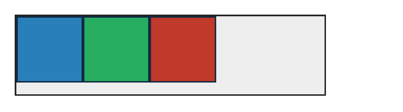
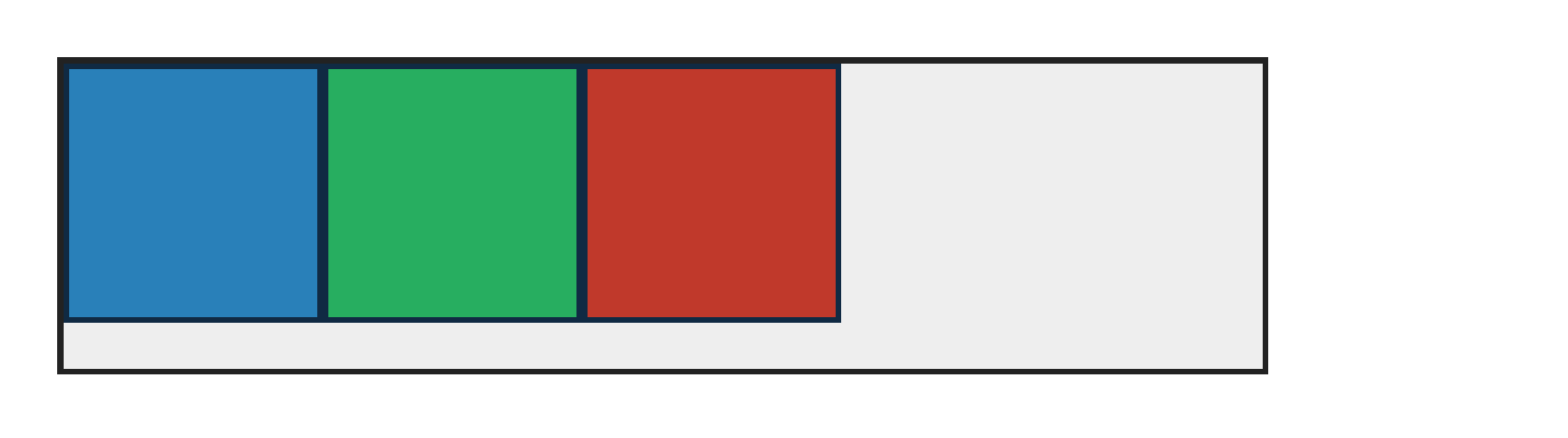
order reorders source boxes (3,1,2) into visual order blue,green,red on the main axis.
PASS exact match flexbox-order-decimal-invalid · integer-grammar
Chrome ref
Chrome ref
ironpress
ironpress
full-page >1.0%/channel diff
order:1.5 is invalid because order accepts integers, so source order is preserved; catches parsers that truncate decimal order values.
PASS exact match flexbox-order-negative · negative
Chrome ref
Chrome ref
ironpress
ironpress
full-page >1.0%/channel diff
A negative order value moves an item before the order:0 items; equal orders keep source order.
PASS exact match flexbox-order-paint-overlap · painting
Chrome ref
Chrome ref
ironpress
ironpress
full-page >1.0%/channel diff
Overlapping flex items paint in order-modified document order when z-index is equal; catches source-order painting that leaves the lower-order item on top.

painting — 100.00% verified visual parity PASS 1 · FAIL 0 · REFERENCE-DISPUTED 0all categories ↑

PASS exact match flexbox-z-index-static · static-flex-item-z-index
Chrome ref
Chrome ref
ironpress
ironpress
full-page >1.0%/channel diff
Static flex items paint in z-index order; overlapping items expose incorrect source-order painting.

percent-height — 100.00% verified visual parity PASS 1 · FAIL 0 · REFERENCE-DISPUTED 0all categories ↑

PASS exact match flexbox-percent-height-stretch · stretch-definite
Chrome ref
Chrome ref
ironpress
ironpress
full-page >1.0%/channel diff
align-items:stretch gives a height-less flex item a definite cross size, so its height:50% child resolves against the stretched 180px line (90px).

place-content — 100.00% verified visual parity PASS 1 · FAIL 0 · REFERENCE-DISPUTED 0all categories ↑

PASS exact match flexbox-place-content-justify · justify-content
Chrome ref
Chrome ref
ironpress
ironpress
full-page >1.0%/channel diff
place-content:center space-between sets flex justify-content:space-between in a row container; catches implementations that ignore place-content.
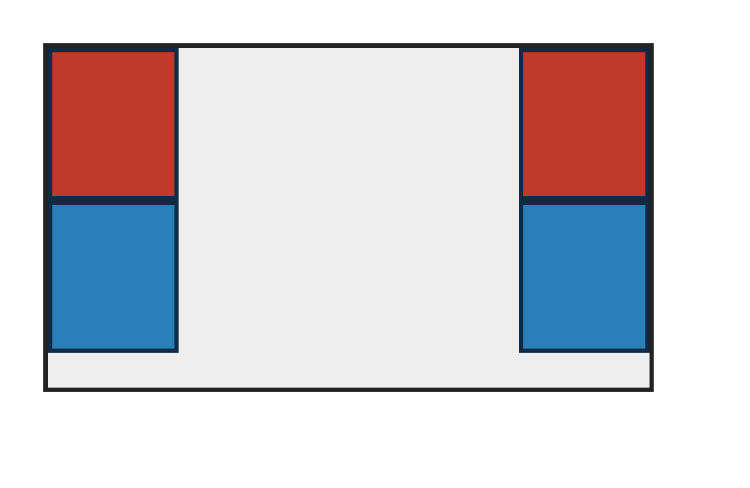
place-items — 100.00% verified visual parity PASS 1 · FAIL 0 · REFERENCE-DISPUTED 0all categories ↑

PASS exact match flexbox-place-items-center · align-items
Chrome ref
Chrome ref
ironpress
ironpress
full-page >1.0%/channel diff
place-items:center sets align-items:center for a flex row container; catches grid-only place-items implementations that leave items at cross-start.
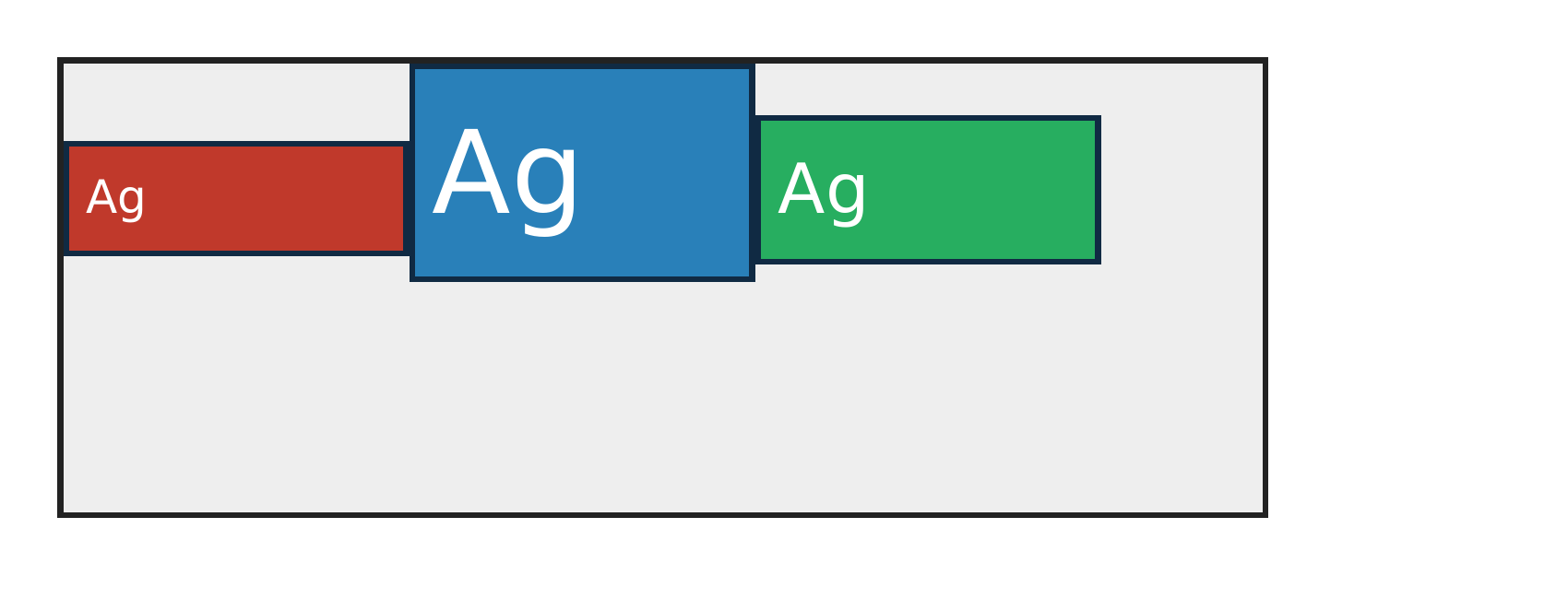
place-self — 100.00% verified visual parity PASS 1 · FAIL 0 · REFERENCE-DISPUTED 0all categories ↑

PASS exact match flexbox-place-self-end · align-self
Chrome ref
Chrome ref
ironpress
ironpress
full-page >1.0%/channel diff
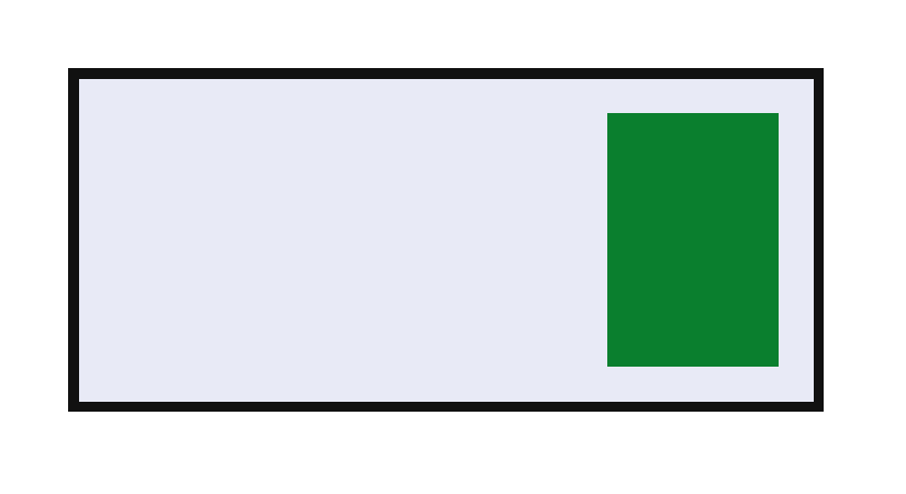
place-self:end sets flex align-self to the cross-end side; catches grid-only place-self implementations that leave the item at flex-start.

root-formatting-context — 100.00% verified visual parity PASS 1 · FAIL 0 · REFERENCE-DISPUTED 0all categories ↑

PASS exact match flexbox-root-page-carrier-single-page · body-flex-page-carrier
Chrome ref
Chrome ref
ironpress
ironpress
full-page >1.0%/channel diff
A body flex formatting context keeps three horizontally fitting children on one page instead of flattening them into separate root-flow blocks.

writing-mode — 100.00% verified visual parity PASS 3 · FAIL 0 · REFERENCE-DISPUTED 0all categories ↑

PASS exact match flexbox-writing-mode-vertical-lr-row · vertical-lr-row
Chrome ref
Chrome ref
ironpress
ironpress
full-page >1.0%/channel diff
writing-mode:vertical-lr with flex-direction:row follows the vertical inline axis; catches parsers that treat vertical-lr as horizontal-tb.
PASS exact match flexbox-writing-mode-vertical-rl-column · vertical-rl-column
Chrome ref
Chrome ref
ironpress
ironpress
full-page >1.0%/channel diff
In writing-mode:vertical-rl, flex-direction:column follows the horizontal block axis right-to-left; catches physical top-to-bottom column layout.
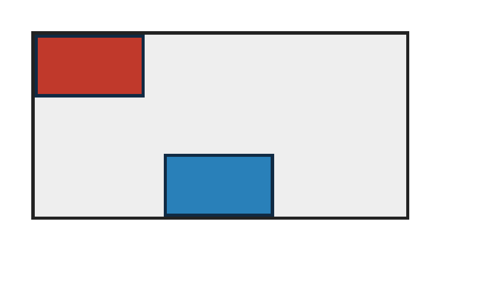
PASS exact match flexbox-writing-mode-vertical-rl-row · vertical-rl-row
Chrome ref
Chrome ref
ironpress
ironpress
full-page >1.0%/channel diff
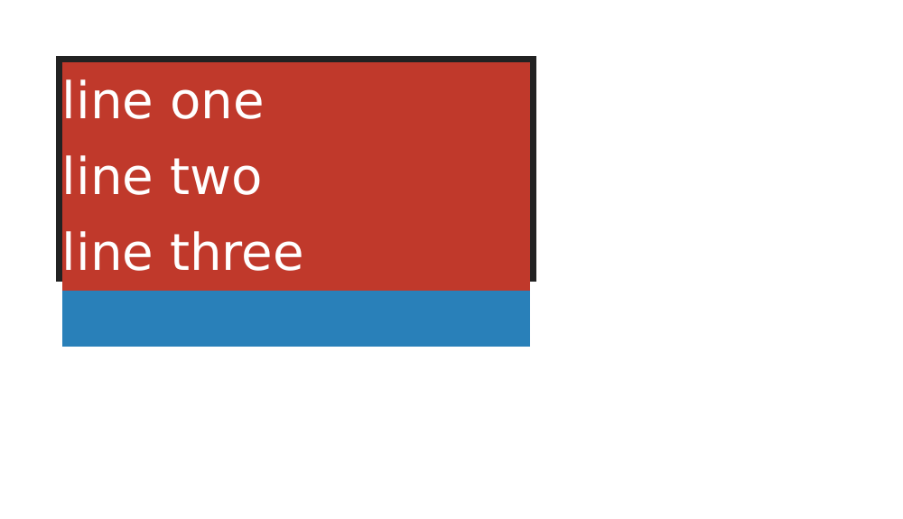
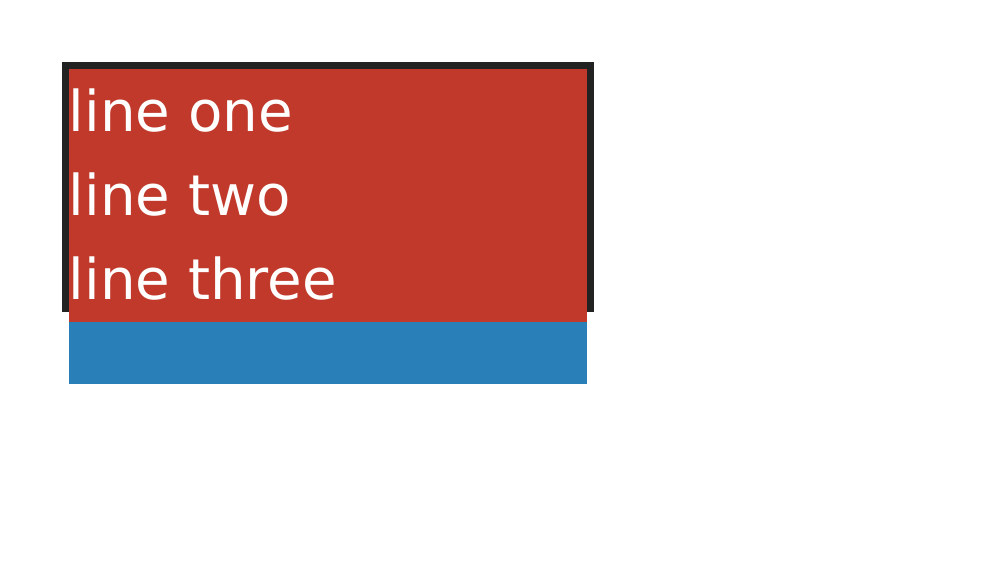
In writing-mode:vertical-rl, flex-direction:row follows the vertical inline axis and stacks items top-to-bottom; catches physical horizontal row layout.